6. Socio-cultural background and Discourse
We are now finally and surely in society with our poster! How does society shape it and how does the poster “actively” take part in society?
6.1 For what purpose was this designed?
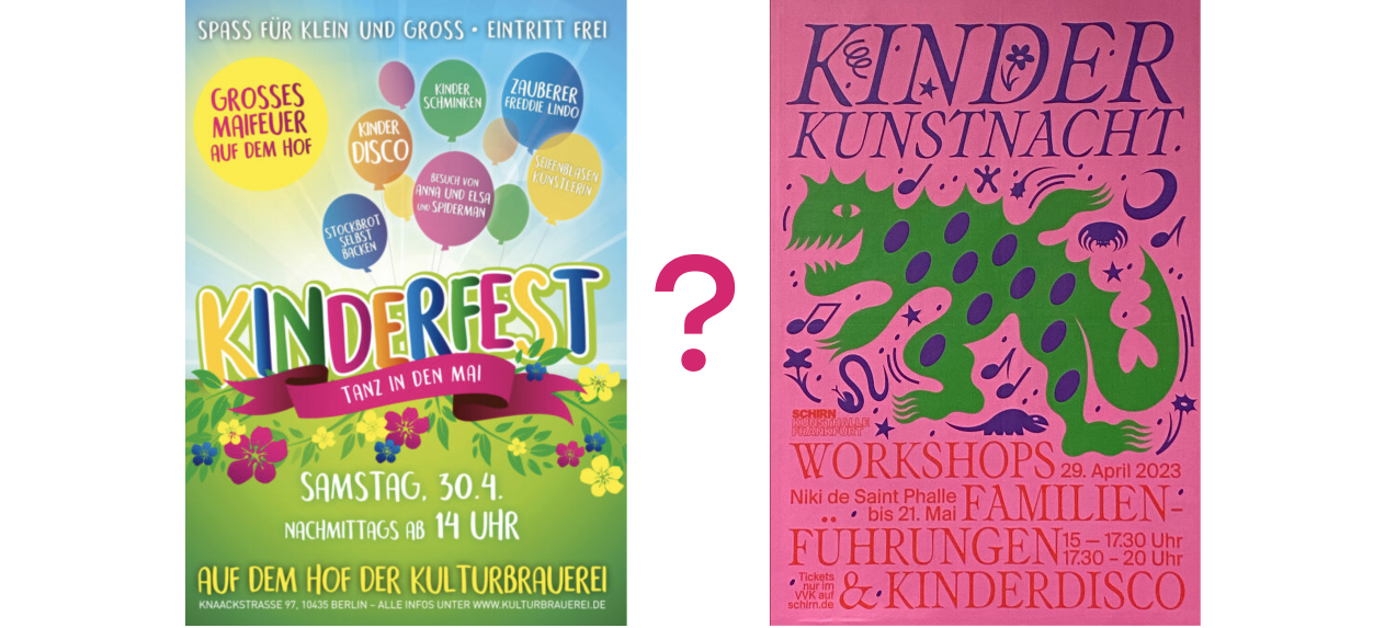
The poster was created to promote a children's event at the Schirn kunsthalle, as well as two exhibitions: Niki de Saint Phalle“ und „Monster Chetwynd. A CAT IS NOT A DOG“.
I took a photo of the poster on April 14 (15 days before the event). And as far as I remember, then I noticed it in the subway for about a month or two.
6.2 Who designed this for whom?
I think the poster was made by a full-time gallery designer. I think that this is a person with a good academic education. I always like the posters of this gallery, and in general, all their identity is well done. In my opinion, one of the best brands in Frankfurt.
The target audience of the poster is young parents who are interested in art. And of course their children.
6.3 What technique was used?
The vector illustration is made presumably in the Adobe Illustrator. It could have been made by the designer himself, or by a hired illustrator.
With the same program designer added the text. I love this Venetian Serif the designer used. It's kinda gentle, and it makes the whole poster feels more tender and less agressive. Still it creates this feeling of "artistry" and "intellectuality" and goes well with illustration. Well, the sans-serif that goes to him in addition dilutes the whole story a little, because without him it would be too much.
After the creation poster experienced offset-printing and went to the subway.
6.4 To which style does this refer?
This mudboard or a selection of references can be explored horizontally and vertically.
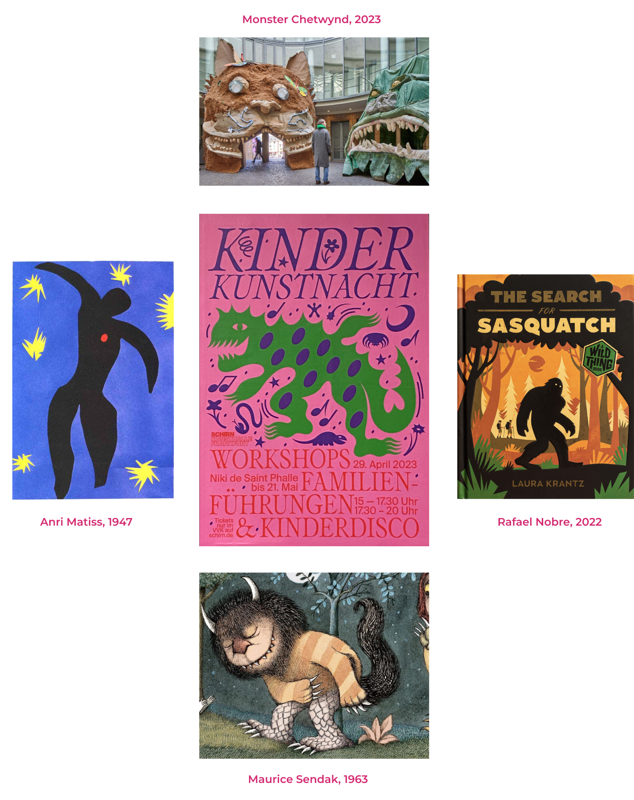
Semantic references are arranged vertically. As I mentioned earlier, the character himself, the “monster”, illustrates the content of one of the two exhibitions promoted by the poster (picture above). It also seems to me that the illustrator in creating his character could be inspired by the classic picture book by Maurice Sendak “Where the Wild Things Are” (picture below). In this book, monsters are (probably for the first time in the history of a children's book) not enemies, but friends of the main character-a child. These monsters are scary and gloomy with their sharp fangs and horns. But in general, they are smiling and kind, and do not wish the child any harm at all. I think this is exactly the character of our monster on the poster.
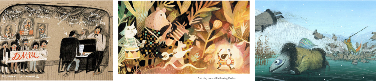
My vertical references speak about graphic execution. The flat, geometric-sloping style is very popular in illustration today. For example (not quite accurate, but still!) a famous illustrator, whom I found on Behance (picture on the right). Where is this style originated, I can't say for sure. But personally, the poster itself reminds me of Matisse's cut-outs in terms of the purity of colors and shapes (picture on the left). I like this particular cut-out of his, how much it looks like our monster on the poster. Both characters are dancing, surrounded by small, sharp stars or flowers. Even the ovals on the monster look like a speck (heart?) on Matisse's cut-out. Maybe we've finally solved the mystery of these ovals, and it's just 11 hearts of this kind-hearted monster.
6.5 What is the socio-cultural precondition for this?
Both the designer and the illustrator could participate in the creation of this poster. They used a computer with an Adobe Illustrator installed on it. I hope they sent the power to the printing house by e-mail, and did not bring it on a stick. The printing house used paper, paints and an offset printer to replicate the poster. Then it was transported to a place from where it, along with other posters, was then taken away and pasted around the city.
Concerning the event itself, to begin with, someone in this gallery decided that there is a need to promote art among children (to have an even better society in the future). The curators of the gallery have chosen during which exhibitions this children's event can be held. Then they gave the task to come up with a campaign to promote the event to the marketing department. The campaign began its existence. Parents and children began to notice a poster in the subway or other advertising of the event and decide to spend Saturday night with their child in this way.
6.6 What is the discourse?
The question of what a children's illustration should look like, I asked myself for the first time in 2015, when I entered the department of book design and illustration at the Moscow Polygraphic University. I spent a lot of time studying children's picture books. And often it seemed to me that perhaps some of these books are too... aesthetic? Beautiful? The right ones?
There was often a feeling that these books were actually made by illustrators for illustrators.
After university, I worked in a startup that creates a product for children. And there I was also haunted by the same question. What are we doing? Everything is so pale (and beautiful), but isn't that why we have so few customers? My boss really liked how I drew. He said it was different from what is on the market. And thanks to our product, good taste is brought up in children!
So after all, what should be the design for children? Bright, friendly? Or could it be something else? Gradually I came to the answer to my question.
Chukovsky has a very precise phrase that if a children's book is interesting only to an adult, it is not a children's book, and if it is interesting only to a child, then it is not a book at all. I like this quote. It allows me to put aside doubts and with a clear conscience do “not childish” designs for children. Don't try to make the design very bright, or bright, or kind. And make it honest. Magical, weird, scary or funny. All these light designs with soft shapes and bright colors, this is essentially a hoax. Our world is not like that. Well, or, not only like that. And when we bring the possibility of a variety of themes, meanings and moods to design for children, we stop deceiving them and become, as it seems to me, better parents.
One more thing. It seems that if the poster was typically childish, it would attract a completely different audience. This poster, such as it is: honest, a little frightening, not traditionally childish, intellectual, and yet funny, attracts an audience that is ready to study modern art and sculpt papier mache monster masks in the middle of the gallery on Saturday evening. So it seems to me that everything is fine with the poster. It's modern, made by a modern gallery for conscious parents who are not afraid to show their children strange modern art. And I am sure that the children of such parents noticed this poster on the subway walls, being carried away by it on an emotional level, and not only at the sign-level of “I see a childish picture, so this is something for children.” And this is sincere. It's fun.