2. Emotions
2.1 Are we affected?
By affected we mean a direct impact of the graphic design on us. Do we have an emotional response caused by this graphic design? Are we moved by this design? Do we want to DANCE?
What are we affected by in graphic design?
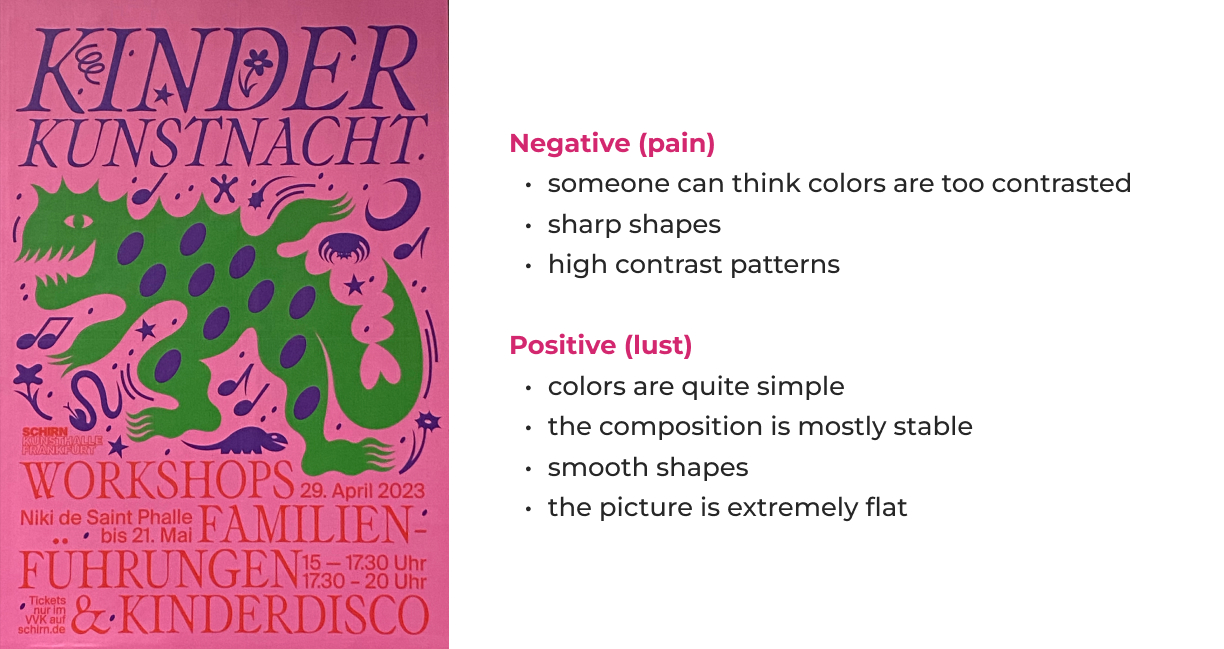
The impact of a design on a viewer can be divided into two categories: negative and positive effects. Negative effects can be characterized as evoking discomfort, while positive effects can be associated with feelings of attraction or desire. These contrasting effects may arise from various factors, including visual elements such as the use of vibrant colors versus smooth gradients, or human figures with suffering on their faces contrasting with those who appear cheerful.
How would vision alone affect us?
The poster is not that simple. It can affect us both negative and positive.
2.2 Do we feel with it (empathy)?
Often we are not directly affected by visual elements of the graphic desing, but we still have emotional reactions. It may happen because of representation (e.g. suffering or smiling humans).
Expressions from humans/living beeings
What else can be felt?
Our senses of hearing, vision, smell, touch, taste, pressure, temperature and pain can be activated by graphic design.
By the eye alone –
the poster is very colorful.
Eye and ear –
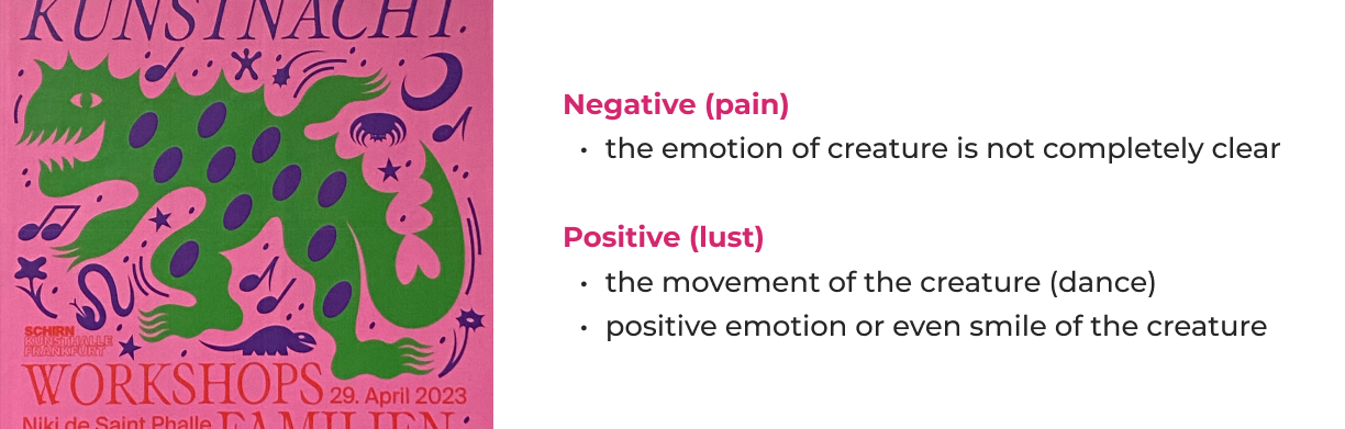
the poster is loud. We see notes and the movement (dance of the dinosaur and creatures around it) and feel it like music.
Same with the eye and body.
Despite the static composition, the character is unstable, and it feels like dance.
2.3 Which mood is conveyed?
The poster tries to convey a joyful and active atmosphere, to involve the viewer in the dance. He's more friendly. Although it is made in cold colors, and this can create an ambivalent feeling – it seems to me that if the colors were warm, the poster would be even more fun.
Using a semantic differential for assessing emotional aspects (2.1–2.3)
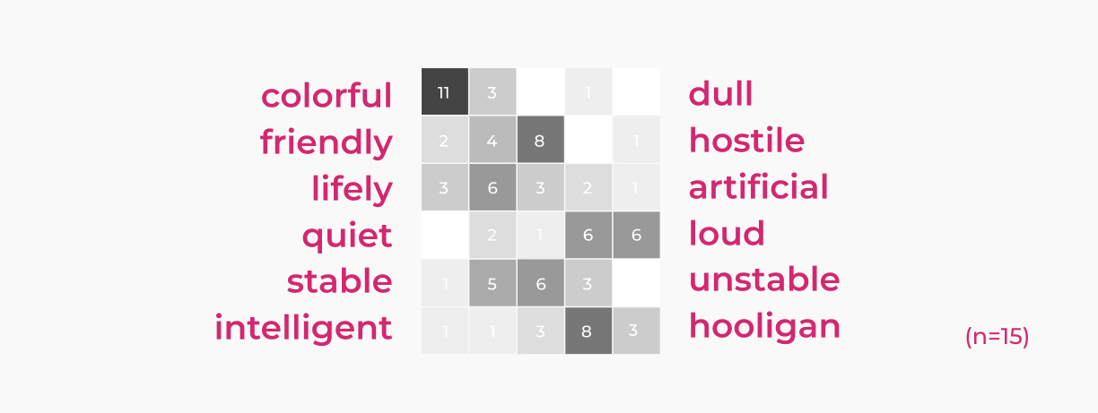
As expected, the majority of the viewers were clear about the colorfulnes. The poster is definitely not dull. It is also clear that it’s loud and hooligan.
But regarding his friendliness, everything is not so obvious. I think this is due to the fact that it is very difficult to unambiguously read the emotion of a dinosaur. There are also a lot of sharp shapes on the poster, which also weakens the effect of a smile, colorfulness, and pulls the viewer in the direction of "something is wrong here."
The result of the answers to the "stable/unstable" item is also interesting. Obviously, different respondents answered different parts of the poster: someone was thinking about the overall stability, even the rigor of the composition. And someone was looking at a dinosaur that, being in this cage from the text, is in an active dance movement and cannot be called stable in any way.