3. Construction
Construction in design refers to the structural composition, the organization of the layout and the alignment and placement of elements. Designers trying to find an ideal balance among these elements. Or, the opposite! Understanding these aspects is crucial as they are the determining factors that influence whether a visual design will effectively capture the viewer's attention.
3.1 What is it made of? What’s there?
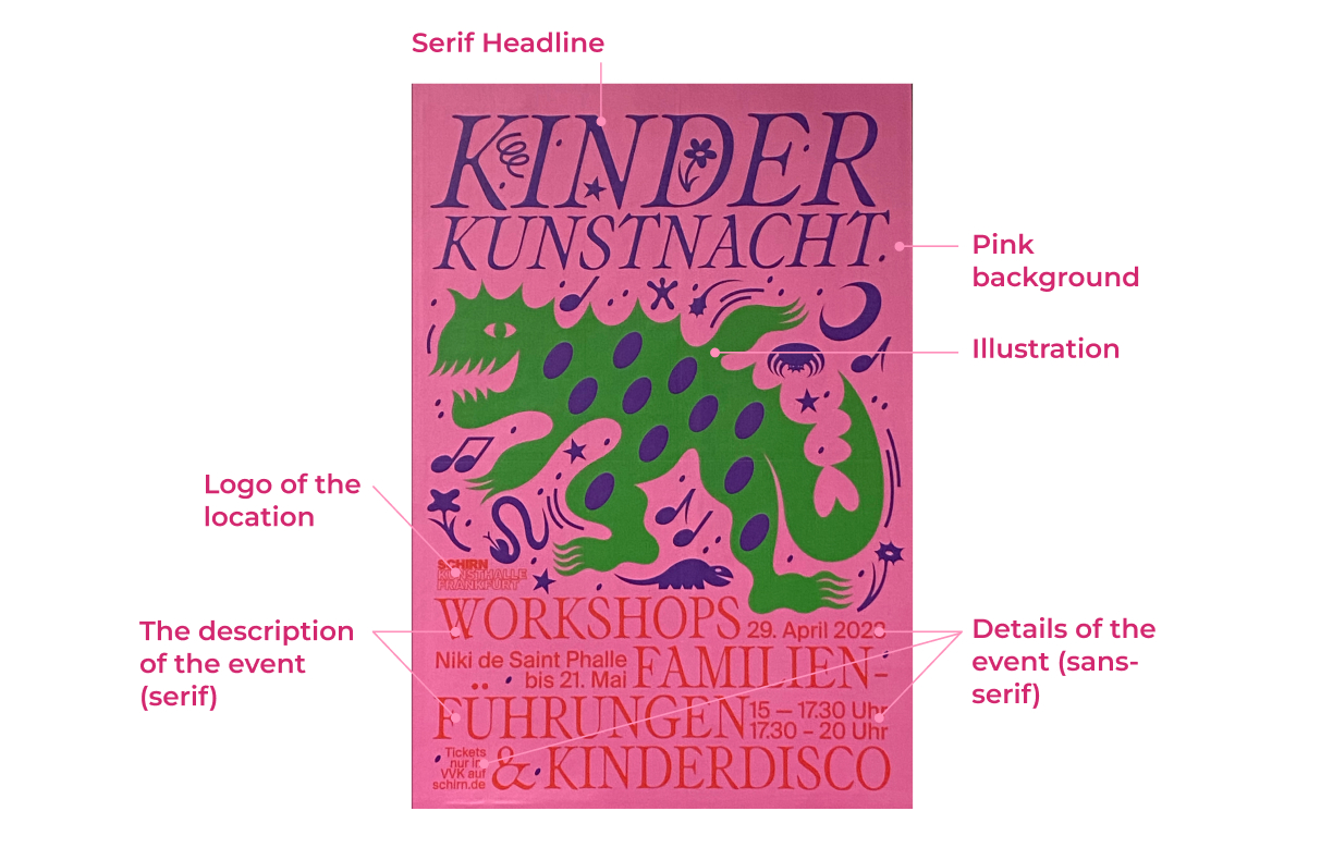
3.2 Where is what?
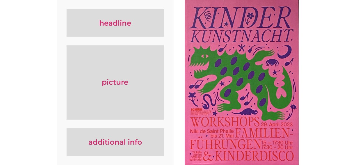
3.2.1 Which arrangement is suggested by the format?
A poster in a portrait format usually suggests to stack the elements vertically in the following order:
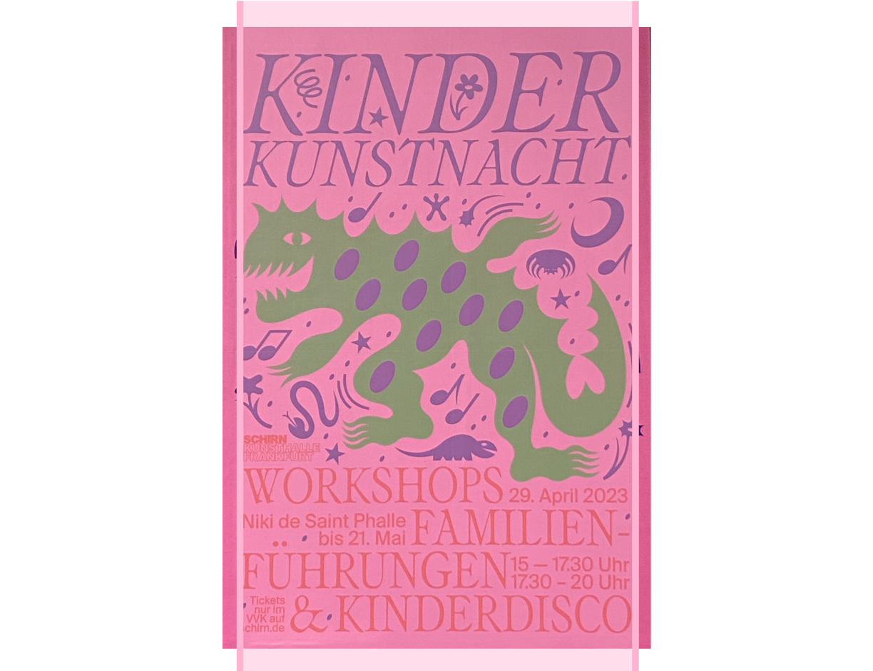
And I look at my poster and think how ridiculously literally it follows a given vertical, portrait format. Everything is in place, and also, based on the first chapter, the viewer tends to study this poster from top to bottom.
3.2.2 How are elements actually arranged? Is there a guiding principle (e.g. a grid)?
Guiding guides:
Symmetrical composition with width alignment, only slightly complicated in the lower part due to the game of serif and sans serif (I really like it by the way, I generally like this poster visually as a designer who went through a harsh academic school :))
Color contrast
The poster is mostly cold. The contrast between the text and the background, as well as the figure and the background, in my opinion, is good. It feels like terrible contrast between the red bottom text and the pink background, but if we get rid of colors, it's ok. But still, the text is barely visible.

3.2.3 Is there balance?
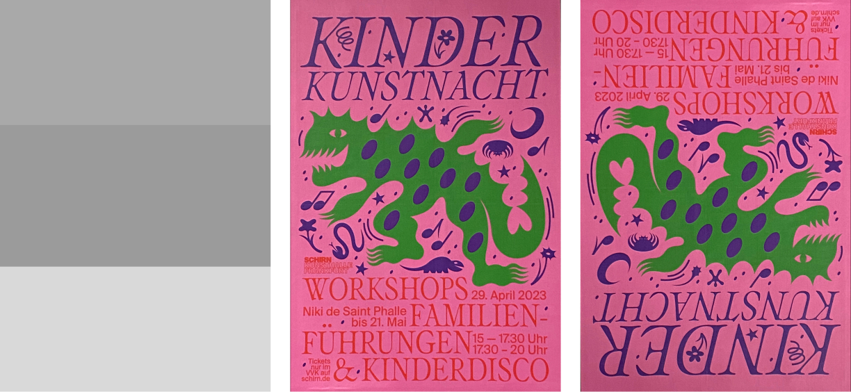
Obviously, the main composition is very balanced. However, it seems to me that the top slightly outweighs the bottom.
Interestingly, inside the illustration, the balance is also present (the heavier upper-left corner and the heavier lower-right corner, against the lighter lower-left and upper-right). But at the same time, movement and dance are shown very actively with the help of signs and directions, so the illustration itself seems unbalanced and alive.
3.3 Does the arrangement suggest meaning?
I don't think there is any meaning in this arrangement. The composition is as simple as possible. The only thing comes to my mind: maybe with the low contrast between bottom text and background the author wanted to tell us that it’s not important where and when you can dance with your children? Do it everytime and everywhere! :)