Aesthetics
5.
Modernism has relegated the idea of beauty to function, so “form follows function”. A commitment to “beauty” is seen as problematic. That design should not be about “beautifying” is a common statement. However, this very discourse of modernism has concealed that modernism is an aesthetic in itself!
Meanwhile, we as designers deal with aesthetic judgements all the time. Therefore, the first and most important task is to become more aware of our own aesthetic biases.
5.1 A first assessment of what I love and hate
5.2 Taste and distinction
Taste is social. You can not just love or hate anything. Depending on your class, status, profession you have to love and hate certain thing.
5.3 Detailed exploration of my aesthetic preferences
I chose my four very different edge cases regarding my aesthetic preferences to talk about in detail:
JUDGE ME ALL YOU WANT, I HATE THIS
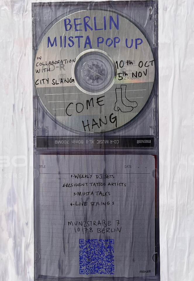
I found myself disliking this particular poster even though, as a creative person from Berlin, I felt like I should appreciate it for its unusual and artsy style. To me, the poster seemed gloomy and difficult to read, with little resemblance to a typical poster. One detail I particularly disliked was the clean cut edge on the otherwise handmade-looking design. Overall, the poster felt like it was trying too hard to be different, which I found off-putting.
In contrast, I spoke with Valentin, who has a great appreciation for this poster (which is why he chose it as the subject of his report). He described the poster as interesting precisely because it breaks from convention. While it may not be easy to read, he found it exciting due to its use of imperfection and the style reminiscent of writing found on CDs from the past. The designer repurposed a well-known design in a unique way to convey a message. Valentin appreciated the scribbles on the poster and admired the designer's ability to communicate a message in a non-traditional way.
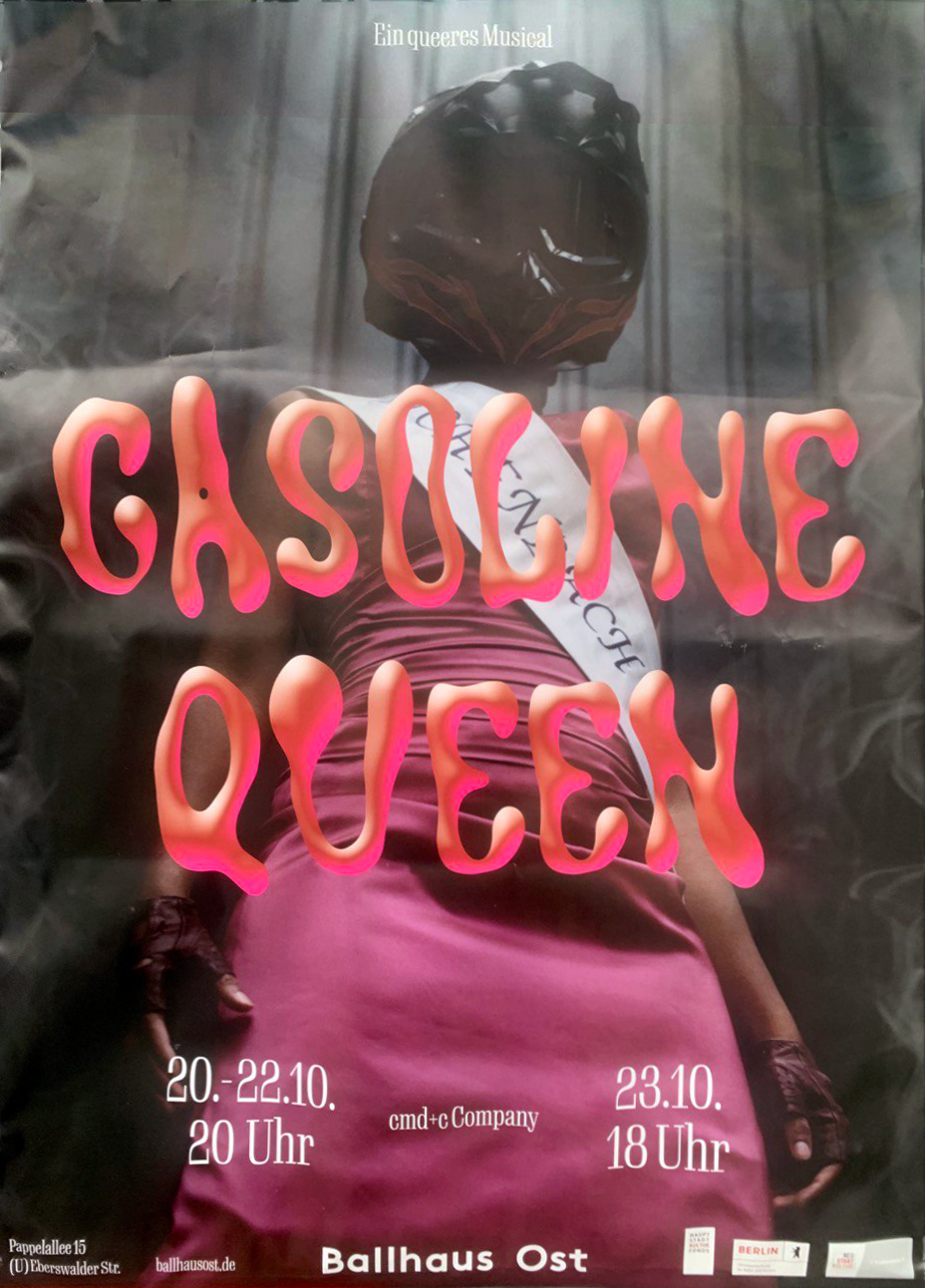
EVERYBODY LOVES IT (IT'S ANNOYING) ♥ ♥ ♥
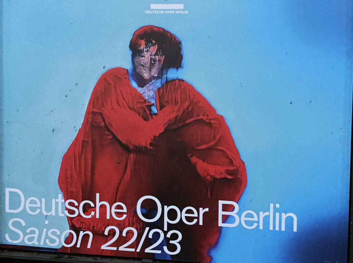
Our infamous Opera poster seems to be loved by everyone. It kind of makes me want to hate it, but… I love the gradients and colors that blend in with each other. The cleanliness is very satisfying to me. I'm sad that it turned out the dark spots on the poster were dirt and not part of the design. :'(
Nevertheless, the blue is unusual, vibrant, and has a smooth gradient, which I really love. Also, it doesn't look flat but very tangible. The figure is very misshapen – it looks like an AI made it, and that's a technique I'm very interested in at the moment. Unfortunately, I just can't find a reasonable explanation to hate it, even though, according to our criteria in Chapter 3, it's seen as unbalanced.
No objections – case closed. 🔨
MY GUILTY PLEASURE
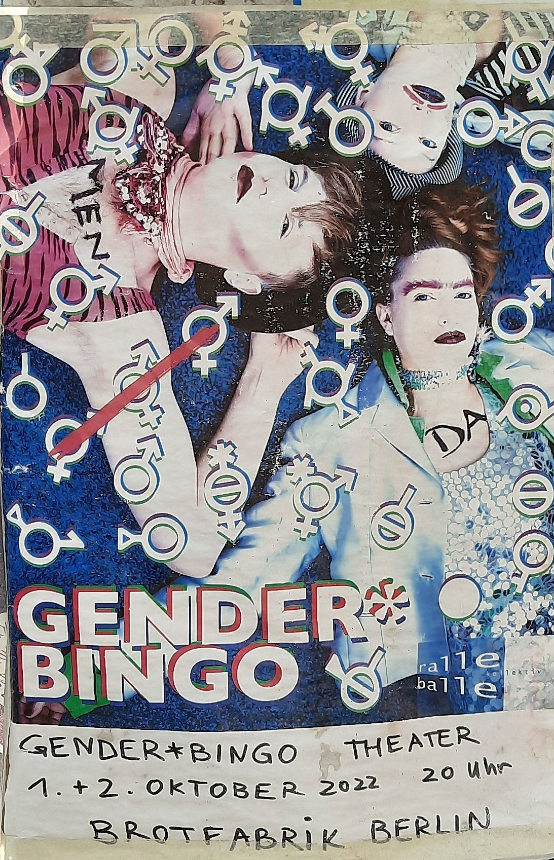
I might be stepping on glass here but I really like this poster. It's not trying to be different, but actually being different. There's so much going on, but it doesn't annoy me, because it brings out the spirit of bingo. It looks punk and kinda reminds me of how Camden must have felt like in the 90s. I get what people dislike about it.
Here's the view of Azadeh: "I hate it because it is ugly and overcrowded, and it gives me a headache that doesn't allow me to look at the poster for more than a few seconds. The colors also intensify my dislike for it. There is nothing appealing about it that would make me love it, sorry!"
HATE HATE HATE
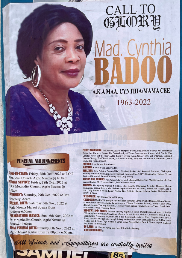
I'm not sure where to start because there are so many things wrong with it. The gradient looks really old-fashioned, the typography is hard to read and it's not visually appealing. There's also a jumble of different fonts that bothers me as a designer.
I'm not quite sure what the poster is trying to achieve. When I found out it was a funeral poster, it made more sense to me. I actually appreciate the fact that it's not just black and white. However, if this was the poster I would be remembered by, I would come back from the dead to change it.
"Looks like it's made in MS Word"
5.4 Sorting out the good and bad from the beautiful and ugly
Check from previous chapters: Is my poster good (in the sense of functional)?
-
Chapter 1: Pre-Attentive Perception
✘
- It doesn't grab a lot of attention unconsciously = not functional
-
Chapter 2: Emotions
✔
- It delivers the message with the right emotions = functional
-
Chapter 3: Construction
✔
- It is very balanced and symmetrically constructed = functional
-
Chapter 4: Semiosis
✘
- The signs are not specific at all = not functional
AFTER ALL THIS TIME? – ALWAYS.
We've seen my poster many times now, and I still kinda like it. It's really hard to describe what I love about it because there are many things wrong with it, such as the line-height, the message that you can't figure out, and the gloominess that doesn't make it stand out on the streets. However, I'm fond of the 3D font, and I really like the digital look. I think this poster would work better online because the colors would be more vibrant. I also like it because it's simple. I design very minimalistic myself. Additionally, it speaks to me because it looks very dramatic and dark, just like all my favorite movies. The LGBTQ relation is always a plus for me, of course.
Jasmin has her own opinion on the poster: "I do not like this type of font at all - it is simply not my taste. I feel like" it's used everywhere and that is also why I kind of got bored of it. I also find it really annoying to read. Besides of that, I think the poster is so dark and really hard to grasp what it's about. Nevertheless, I think it is visually balanced."
More opinions:
"The design is very modern."
"… the pink colors merge smoothly with the black, even though I hate pink."
"I like how dramatic the angle is. Typography seems to be in trend. Love the composition overall."
"I couldn't get key information from this poster. The font of the title is very hard to read, and I feel that there is no connection between the font and text."
Conclusion
I came to the realization that people (even a class full of designers) have different opinions on what makes a design good or bad. It's interesting to see how personal experiences and preferences can influence our perception of design choices. For example, one person might prefer simple and clean design, while another may appreciate intricate details.
Additionally, I believe that our taste in design is not static and can evolve over time. Our taste can be influenced by various factors such as current trends, our sources of inspiration, experiences and our individual personality. Something that appealed to us a few years ago might not necessarily appeal to us anymore, due to changes in our personal taste or trends in design (I look back in horror to what I liked a few years ago).
I think it's important to embrace this evolution in our taste, as it allows us to appreciate and enjoy the diversity of design styles available.
5.5 Style
Aesthetics in graphic design boils down to style …
…who is actually targeted?
To find out about the target group, I found some posters in contrast to mine all over Berlin (I couldn't stop searching for them at one point).
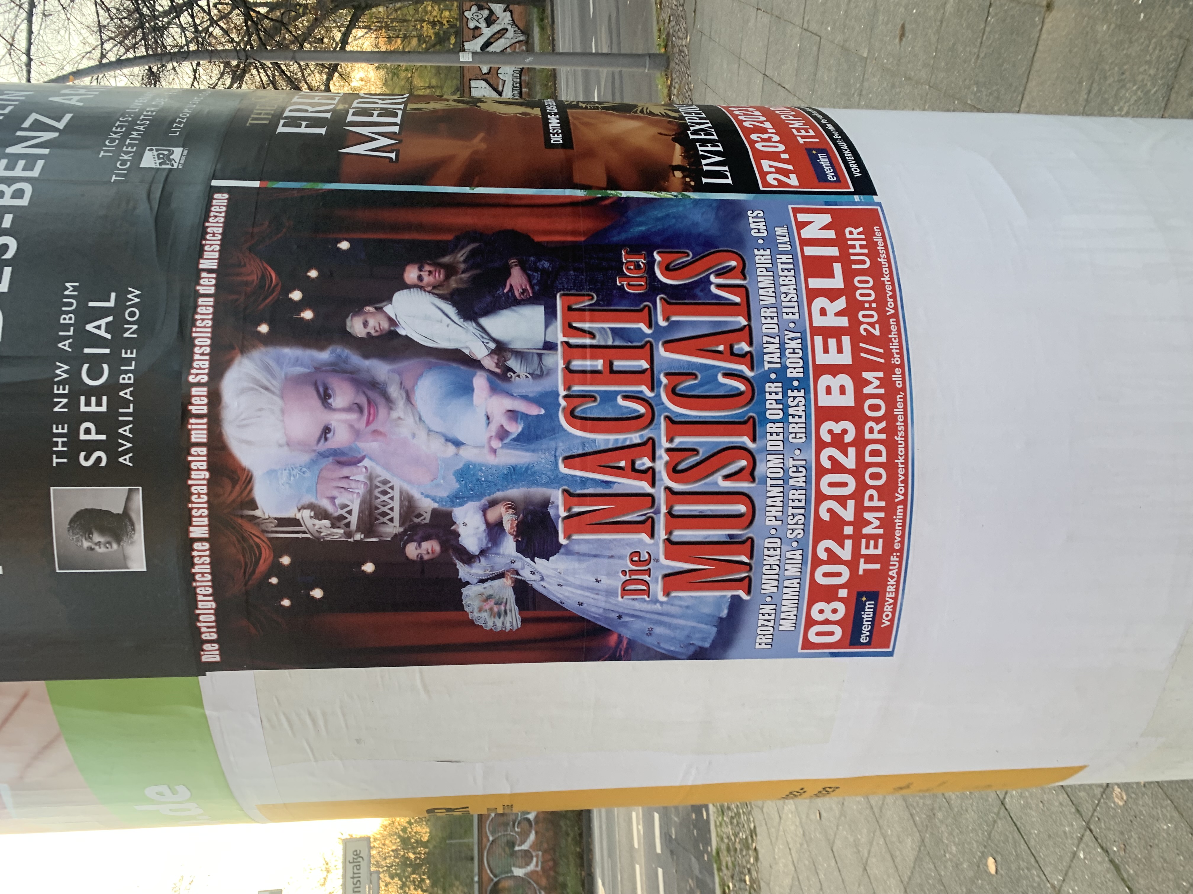 Lange Nacht der Musicals: In contrast to this poster, I would say that the target group for my poster has a higher level of education and is more interested in art and the cultural scene. Somehow I can see middle-aged straight women being drawn to this event...
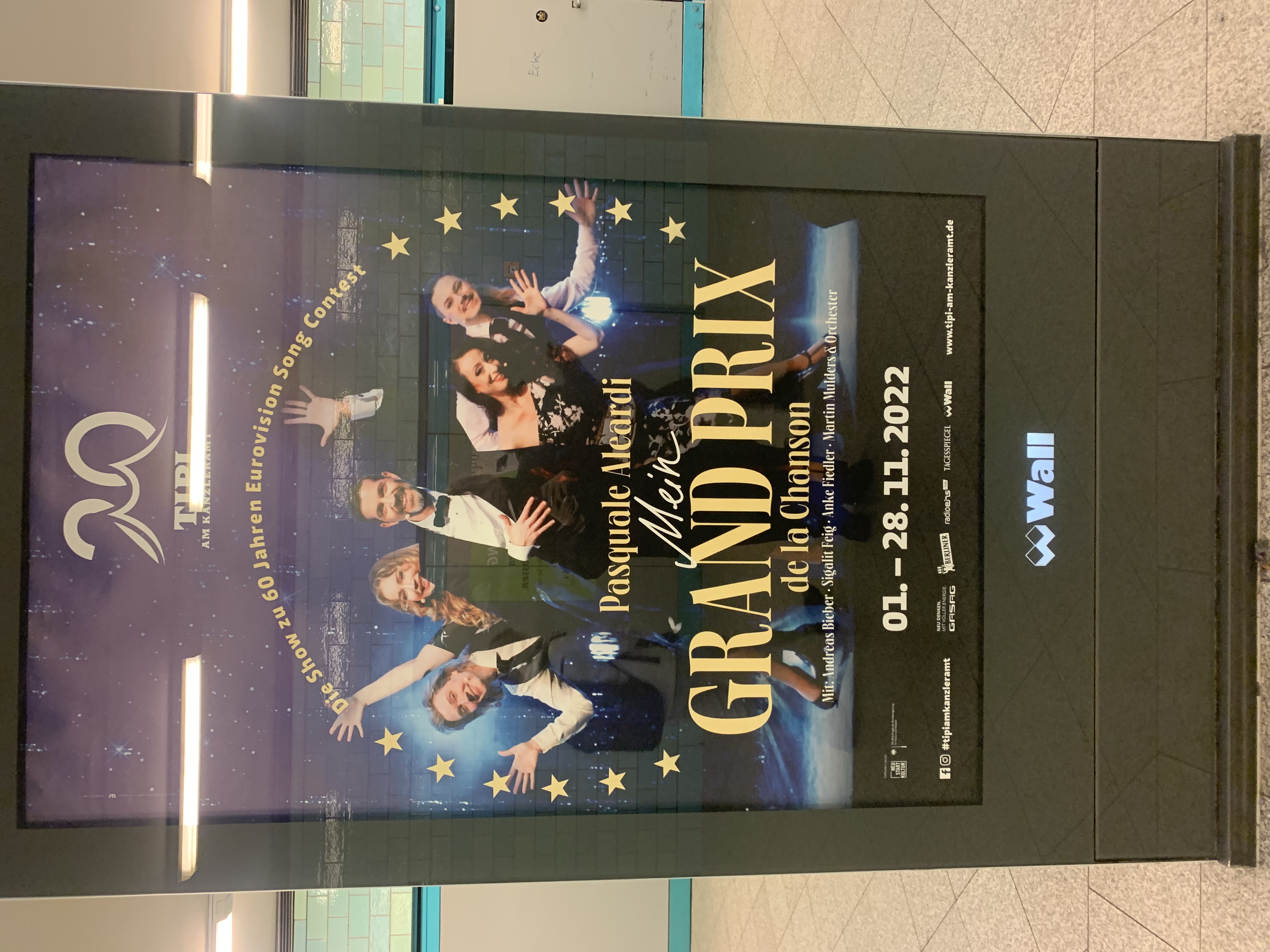 Mein Grand Prix de la Chanson: I can see queer people being drawn to this (because it's about the Eurovision Song Contest), but they are older probably a little older then the audience for my poster.
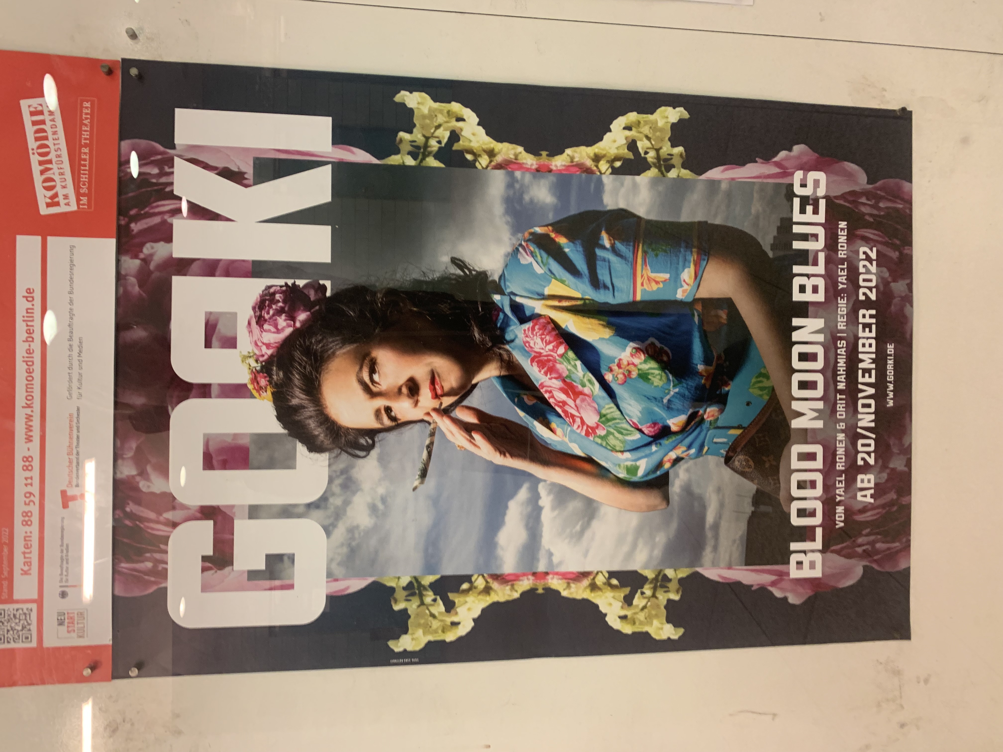 Blood Moon Blues: This is a theater poster with a modern aesthetic, targeting a young and artsy audience. However, it may come across as slightly overwhelming or challenging. This event requires some intellectual effort to fully appreciate, as the art may be complex or difficult to understand (as it is often the case in Gorki, I can tell you).
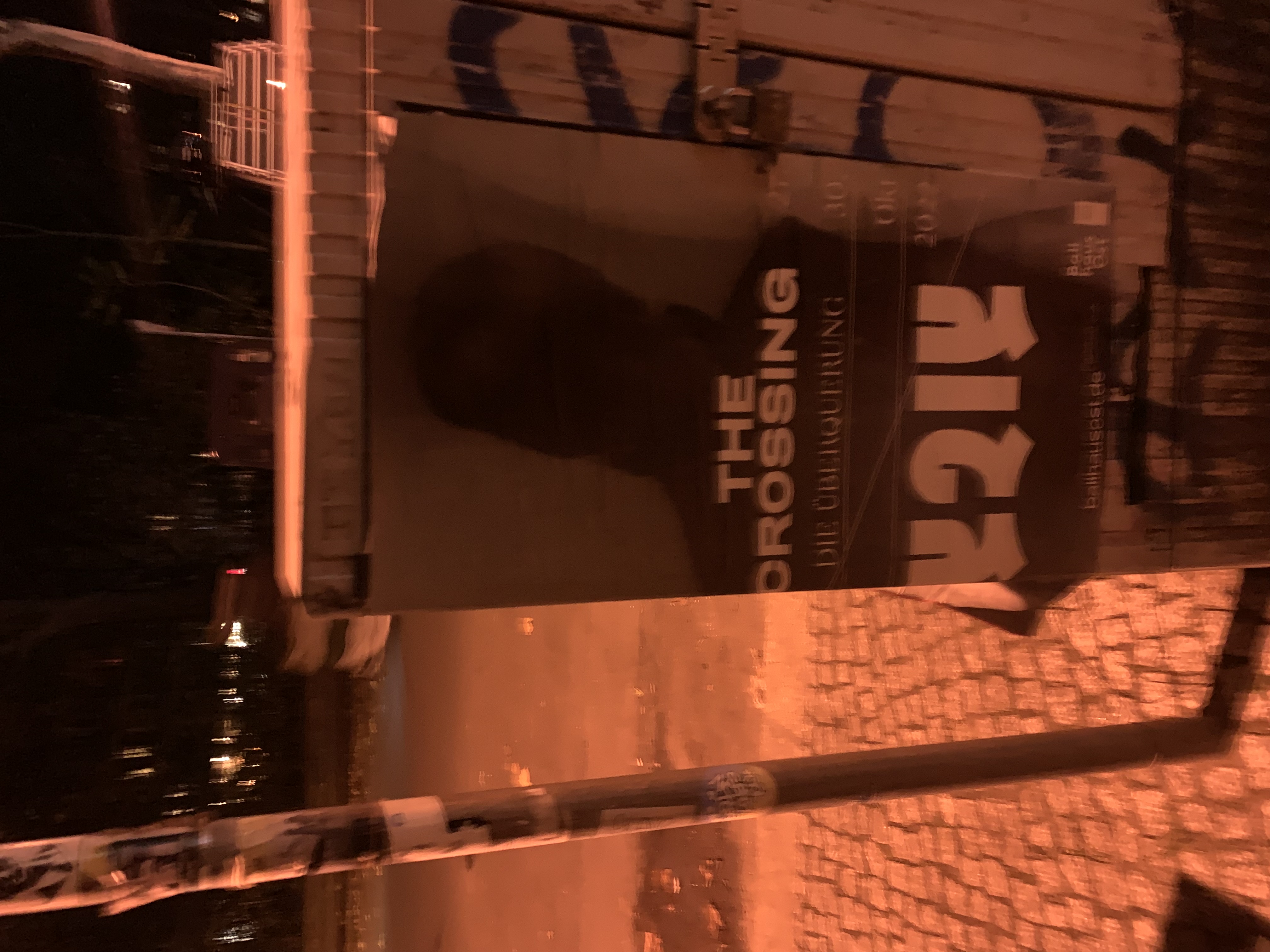 The Crossing: I couldn't find any other posters with a similar target audience to mine, but I happened to stumble upon one in the middle of the night and quickly snapped a photo (apologies for the poor quality due to my tipsiness). However, upon closer inspection, I discovered that it was also promoting an event at Ballhaus. At least they have a consistent design, though! :D
After looking at the other posters I figured the aesthetics of my poster present an artsy style. I can see people being addressed to it that usually like some kind of cultural entertainment. Compared to other posters I would say you have to have a little higher education to be addressed – not as high as for the Opera, but also not as low as your basic hometown Cat musical. Also it targets queer people, not only because of the description in the top, but also because of the gender bending photography (which I'm gonna talk a lot about in the next chapter, so stay tuned).
Last but not least I did a little experiment to find out if queer people would be a target group by asking the AI (DALL·E) to create a poster for a queer audience. The exact wording was: "Create a musical poster for a small, queer theatre. Integrate the main actor, that has a motorcycle helmet on. Target queer audience.") These are the results:
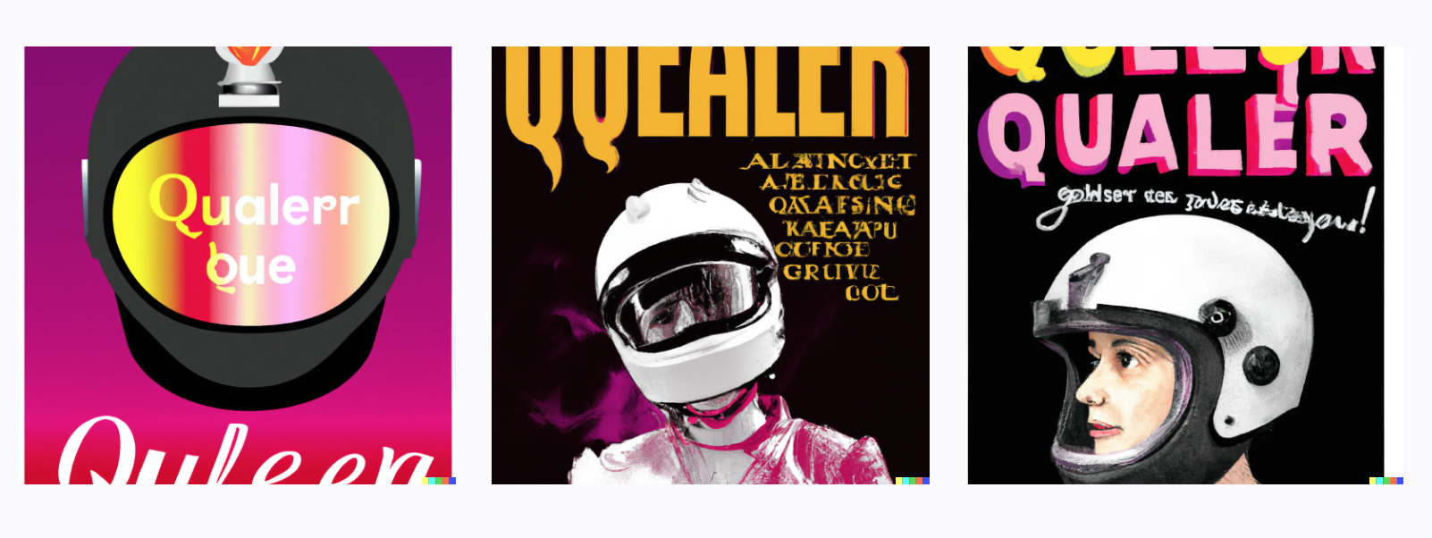
Point proven. 😌