Semiosis
4.
We now analyze graphic design as a composition of signs that conveys meaning (without ever mentioning any of the sign classes :D)
4.1 Visual Rhetoric: How are the signs used to mean something?
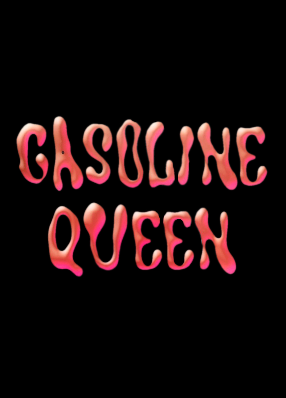
The shape and the colour of the font are very informal and playful. It looks a bit like you had one drink too much (eventually promising an eventful and fun evening?...)
Adding to this the font also looks like a liquid – Gasoline is a liquid. So this is an obvious reference to the meaning of the word.
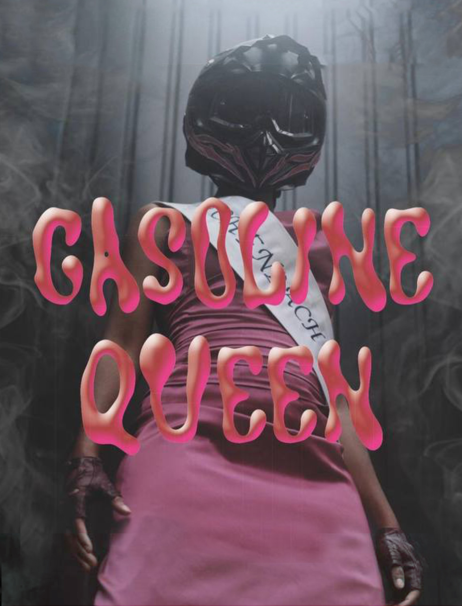
With the text and the picture together the meaning is doubled: "Gasoline Queen" and the figure refer to the same person.
4.2 Multimodality: How do the signs work/play together?
The text and the picture definitly have to work together. Semiosis is almost not happening without the written words. Without the text it's just a human in a dress, standing in the middle of a dark, industrial room:
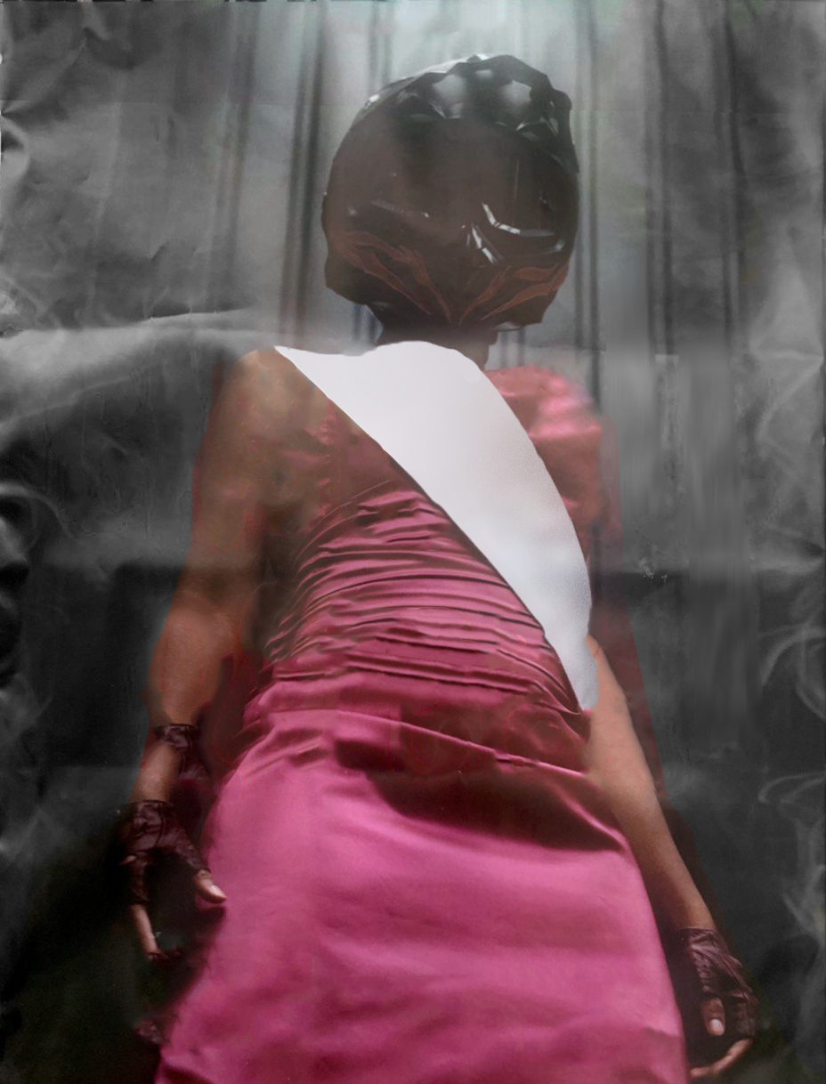
The best guess you can have is that it has to do with motor sports, since there's a helmet (that you can barely identify) and a sash. And if you look even closer you can see the smoke on the sites. Together it somehow references to some kind of race – maybe motorcycles, but it could also be cars.
The pink dress and the sash combination also hint at a relation to beauty pageants or some kind of competition – which is also related with races again.
If it would just be the headline "Gasoline Queen" together with the photograph, but no further context, it would be hard to guess that it's actually a musical:
You can clearly see the power of the text over the image. Designer can change the meaning of visual graphics with text, so that it's basically overruling the image. To prove this point I made three posters with the same image & headline combination, but in different locations/contexts. And as you can see, it still works and doesn't look out of place at all:
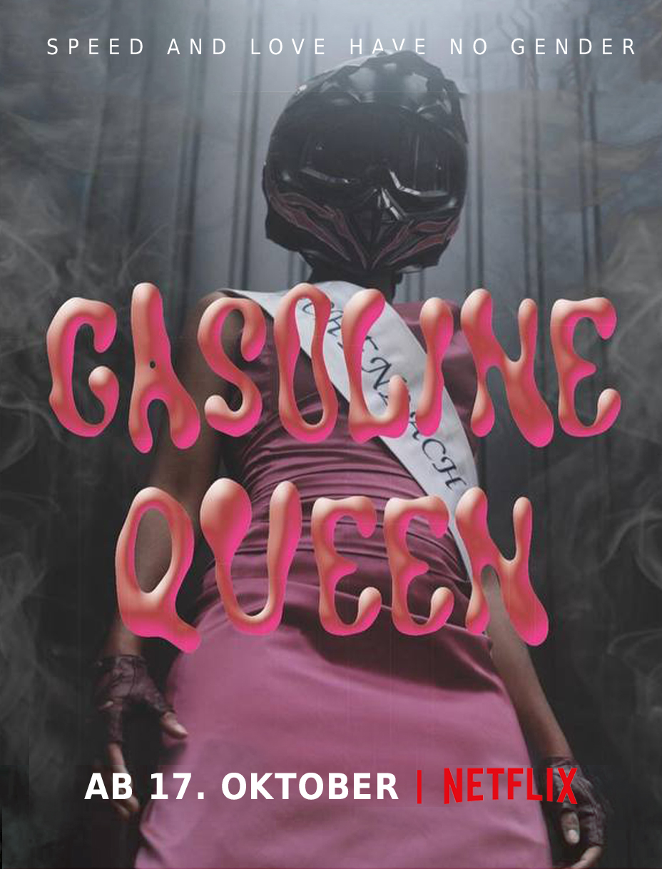
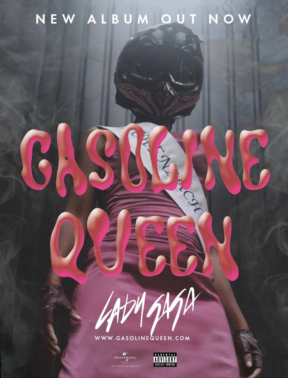
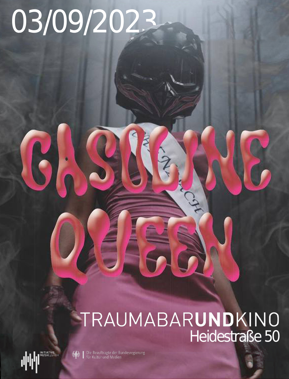
This shows in a very obvious way that semiosis-wise the poster kinda sucks (sorry).