Construction
3.
Construction is all about how you put together a design. It's like arranging puzzle pieces - everything should fit just right. Elements in the design should be balanced and work well together. And if you can get them to interact with each other, that's even better!
3.1 What is it made of? What’s there?
3.2 Where is what?
3.2.1 Which arrangement is suggested by the format?
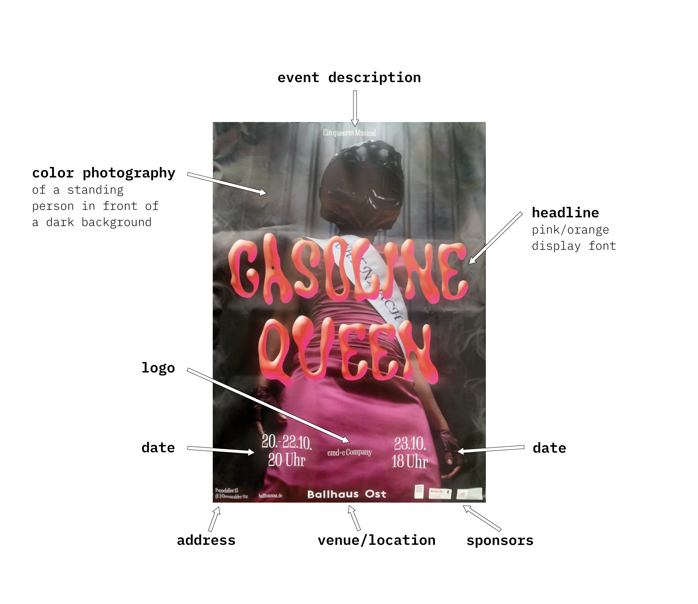
A poster in a portrait format usually suggests to stack the elements vertically in the following order:
headline

picture/motive

additional information
This poster is basically following the usual suggestion of the format, except that the font is in the center, overlapping the picture in the back. The actual arrangement looks vaguely like this:
additional
information
3.2.2 How are elements actually arranged? Is there a guiding principle (e.g. a grid)?
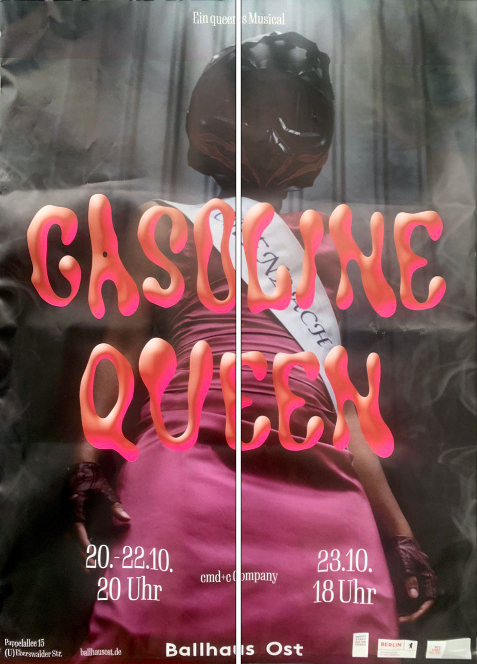
General arrangement: The guiding principle is really simple: it's a line in the center. The picture and the text are arranged very symmetrically to this line as you can see here:
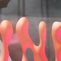
Font arrangemet: The font size is almost as wide as the format itself, occupying a significant amount of space. Moreover, the line height of the headline is abnormally large, consuming a considerable amount of horizontal space as well. As demonstrated in previous chapters, the font draws a lot of attention.
Cold/Warm contrast: The pink in the poster appears to be a cool color because it's more on the magenta/violet side of the color spectrum (or in other words a cool bluish red), while-as the orange is a classic warm tone.
Light/Dark contrast: The poster has a strong contrast between the dark background and the light font. It seems very theatrical.
Simultaneous contrast: The orange/pink affects the way the background is received. It appears to be more red, instead of actually grey. Somehow it also seems like the type is glowing.
3.2.3 Is there balance?
The poster has a great sense of balance. We already figured out that the elements are nearly symmetrical when you mirror it with a vertical center line. From top to bottom this is not the case, but this doesn't disturb the balance at all – as stated by Kandinsky: »–the 'above' gives the impression of a great looseness, a feeling of lightness, of emancipation and, finally, of freedom.«. I can prove this theory by turning the poster around. It suddenly appears extremely heavy on the top:
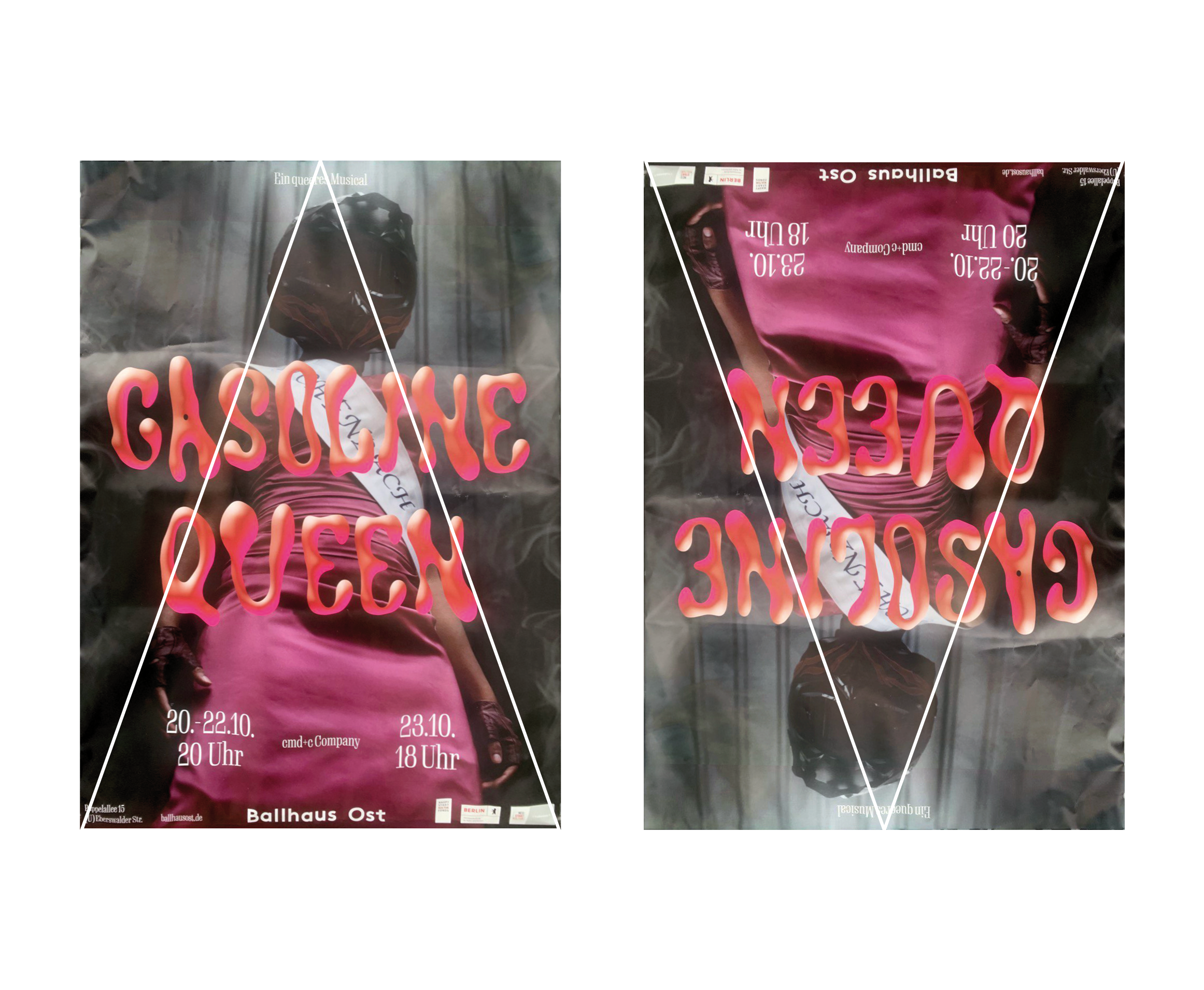
The pyramid form makes it steady, while-as the inverted triangle is looking unstable and not balanced at all. In conclusion this is an extremely balanced poster.
3.3 Does the arrangement suggest meaning?
The font is huge in the center, so it suggests that the name of the event is important and announcing the content of the poster.
The center placement of the headline also suggests that the so-called „Gasoline Queen“ is the person in the middle.