Emotions
2.
The focus of this chapter centers on emotions. To construct a Semantic Differential, I identified two words within each category that best capture the emotions presented in the following sections:- Are we affected?
- Do we feel with it (empathy)?
- Which mood is conveyed?
2.1 Are we affected?
By affected we mean a direct impact of the graphic design on us. It's basically asking: Are we moved by this design?
How would vision alone affect us?
The affect is in this case purely based on our visual reaction to the design:
- Negative (pain)
- very bright stuff?
there's pink, but it's not painful - fast flickering stuff?
no - figure-ground-flicker
yes, some parts in the center - sideways movement
nope
- Positive (lust)
- smooth gradients
no, not enough to talk about it - monochromatic surfaces
no - smooth roundish shapes
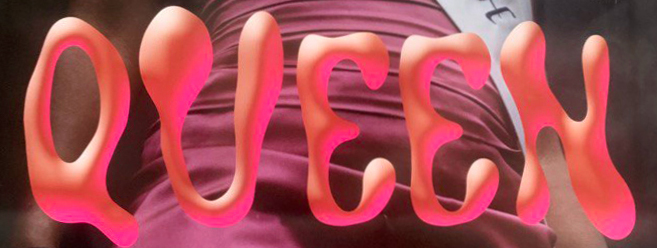
yes, the font - one simple shape
no, too much going on
If the poster is having a negative effect on us, it may be due to a figure-ground-flicker in the following section:
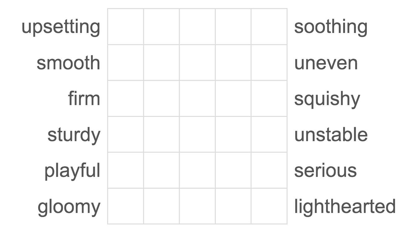
It could potentially be upsetting for some individuals, that's why I chose the following terms for my differential:
 On the positive side I would argue that there is a smooth roundish shape visible, which is the pink dress of the person and also the font. Especially in comparison to the previous example for the figure-ground-flicker it feels very relaxing to the eye:
I'm adding the following term because I'm curious how people will perceive the poster:
…other stuff that affects us?
There are also things that affect us not only visually (suffering, death, smiling humans, naked people), but none of that is relevant for this poster.
2.2 Do we feel with it (empathy)?
Often we are not directly affected, but we still have emotional reactions to graphic design. People generally connect more with designs that evoke strong basic emotions such as anger, love, hate, happiness, sadness, disgust, or surprise.
Expressions from humans/living beeings
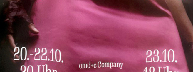
There's no facial expression in my poster, because the head is hidden behind a motorcycle helmet. We still need to talk about the posture: The person looks down on the viewer and leans back. The posture doesn't seem sturdy at all, instead it might make a rather unstable impression.
What else can be felt?
Not only humans evoke emotions in us. Our senses of hearing, vision, smell, touch, taste, pressure, temperature, and even pain can be activated by graphic design. Let's explore how this is relevant for my poster:
By the Eye alone: The poster is, except of the pink font, extremly dark and gloomy.
Eye/Hand: This is the most important part of my poster in this chapter and the reason why is very obvious: the font basically invites you to touch and squeeze it.
Eye/Nose: It's hard to even see the smoke on the sides of the poster, and I didn't notice it until I found a digital version of the poster. But when you combine the smoke with the helmet, it kinda reminds me of the smell of gasoline or burnt rubber from a car's brakes.
2.3 Which mood is conveyed?
We talk in terms of mood, atmosphere, overall impression … think of the whole poster as a stage.
If I compare the poster to others of this genre (especially musical posters) it looks serious and gloomy (as mentioned before). Usually musicals are colourful and bright, promising a fun time. You can guess from the posters mood that the promoted play is not going to be a comedy, but a rather serious musical. It is rather cool, not goofy. I chose the following terms for my semantic differential:
serious - playful
lighthearted – gloomy
Using a semantic differential for assessing emotional aspects (2.1–2.3)
A semantic differential is a tool that asks people to rate something using a scale of opposite adjectives. By using the semantic differential, designers can make more informed decisions about how to use color, typography, and other design elements to create the desired emotional or cognitive response from the vier.
Construction of a semantic differential
This is the questionaire I used:
Results and discussion
The results of the survey above are presented in order of the most to the least unanimous responses. As expected, the majority of the viewers were clear about the squishiness of the poster, which is likely related to the font used. Furthermore, most participants were convinced that the poster was rather gloomy, which matches the serious subject matter of the play.
Speaking of seriousness, respondents were uncertain about the playfulness or seriousness of the play. However, this can be seen as a positive thing, as the play is being taken seriously while still promising an entertaining evening as a musical.
The tendency leaned to the poster being uneven and not smooth. This suggests that the roundish shapes and monochromatic surface of the design are not distinctive enough to elicit a strong response (affect) from participants.
Overall, the survey results show that it is triggering a lot of emotions and the participants are very relatively clear about their choice.