Pre-attentive perception
1.
Pre-attentive perception is the subconscious accumulation of information from the environment. It represents the first impression of a design and happens without conscious effort.
So, why is it important for the designer? People tend to overlook graphic design in the streets, whether it is due to the vast variety of ads or their disinterest in certain topics and especially ads. Pre-attentive perception reveals what people notice about a design without conscious effort. If a poster manages to catch people's attention, they will eventually take a closer look. Designers could exploit this by creating especially flashy designs and incorporating sudden movement, for example, through animated ads (although that could also be seen as annoying).
A realistic scenario where we would meet our poster is:
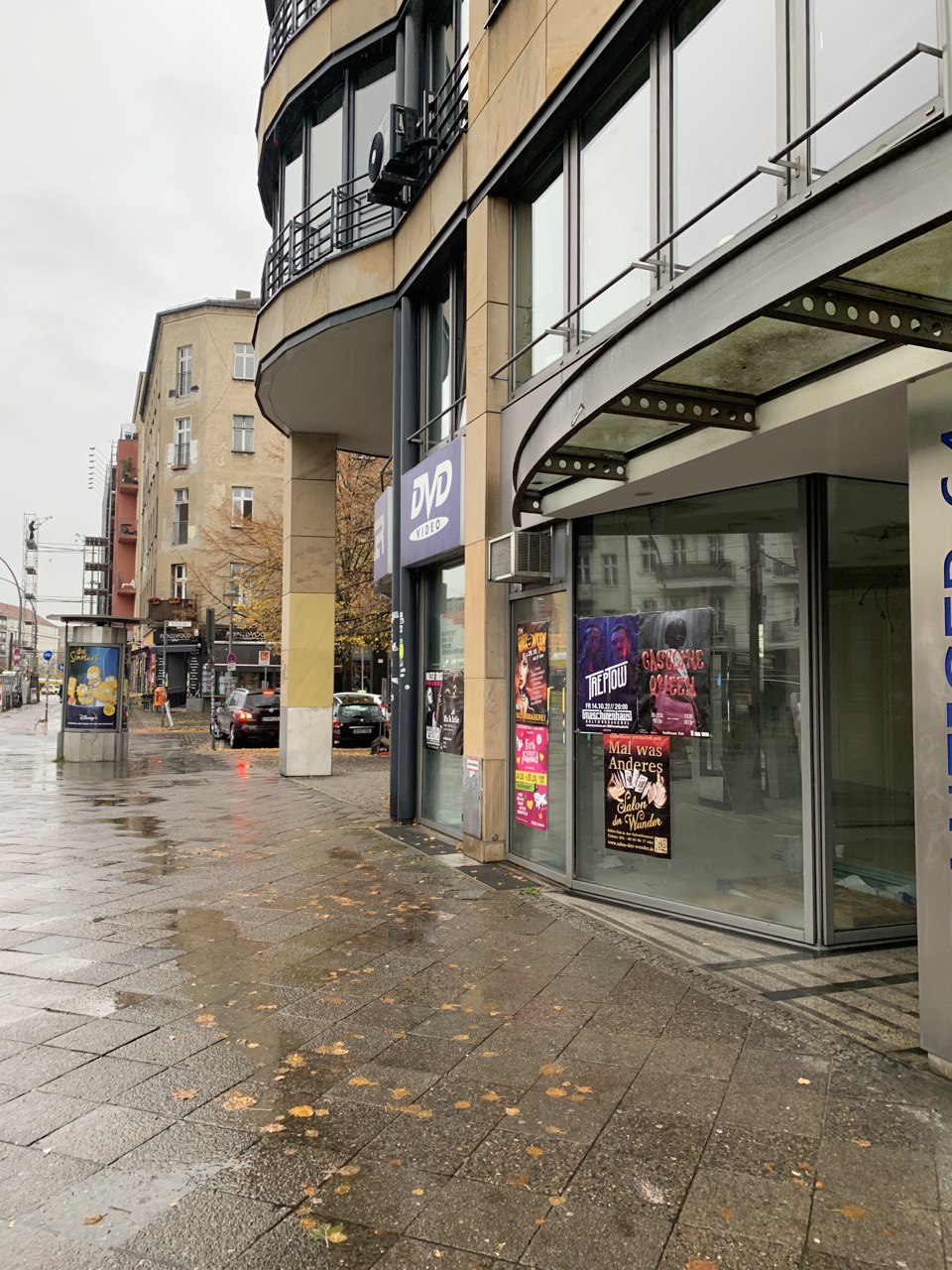
Did you spot it? I really had to take a closer look to find it on the streets. After I spotted it for the first time, I noticed this poster in the area frequently. Most of the time, it was in close proximity to the venue it's promoting, which makes a lot of sense.
1.1 Peripheral Vision Experiment
Peripheral vision guides us vaguely through the world. To test what we would see on the poster just by walking by, I held the poster on my smartphone an arm's length away from my face, feeling a little odd as I was sitting in a café while doing this.
I raised my other arm and focused on my thumb, determined to see what was on the poster without any preconceived notions. And let me tell you, it was a challenge.
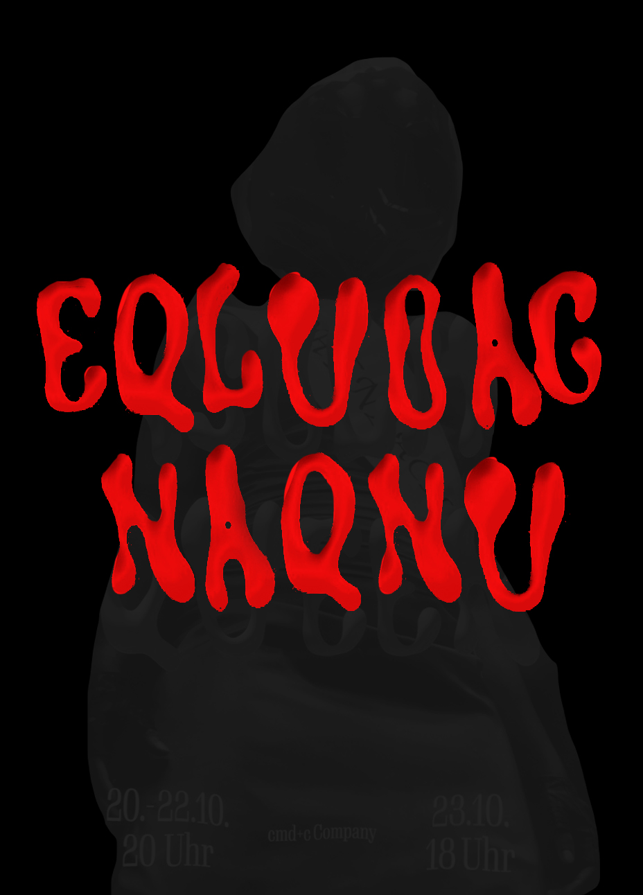
However, through my peripheral vision, I could make out the vague shape of a person in the center. There was also a reddish pattern in the middle, with the bottom part leaning more towards pink and the top part being black. It looked something like this:
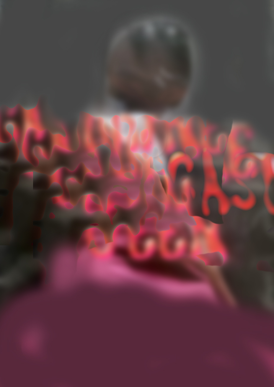
It seems that Peripheral Vision doesn't guide us to the poster, making it nearly impossible to notice it on the streets without effort. The truth is, I wouldn't have seen the poster myself if I hadn't been actively looking for one to write a report about. 🤷
1.2 Showing some people the poster for just some milliseconds!
For this experiment, I had six participants who looked at the poster for exactly 27 ms (using the Tachistoscope). By quickly showing the poster to people, I could see what caught their eye first. Here are the things that people usually notice the most:
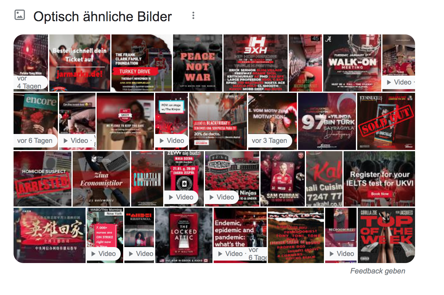
It's really surprising that almost everyone noticed the color red instead of the actual pink color scheme. But then again I put my poster into Google Search to look for similar images and noticed that even Google thinks it's red:
With the results in mind I created a simulation of what is seen in just some milliseconds:
1.3 Checking with Gestalt principles
Of all the six Gestalt principles I found only two to be relevant for my poster.
Similarity
We can see Similarity in color and form when we look at the headline font. It's pink/orange and it's huge so you can tell it belongs together. Also the white font for the additional information is the same in color (white) and font (serif).
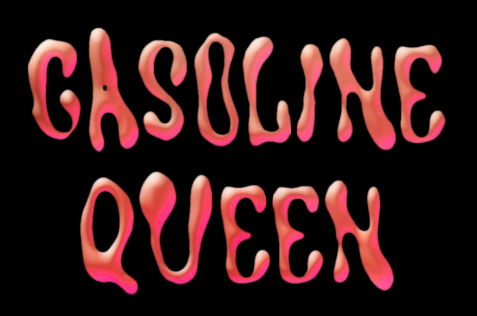
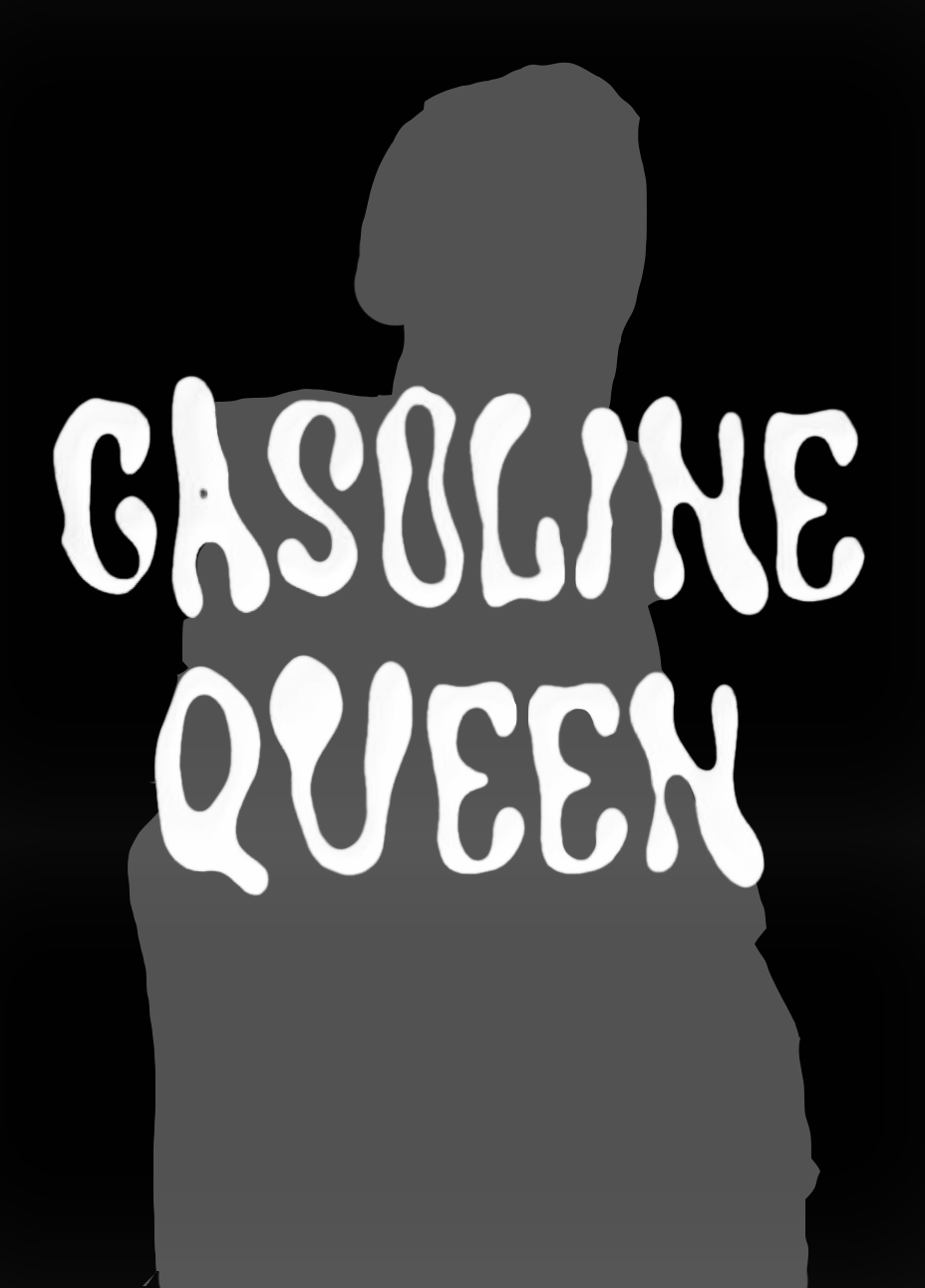
Figure-ground
We perceive the Figure–ground because we clearly identify the figure (the text in the front) from the background (the photograph).
1.4 What do we really look at?
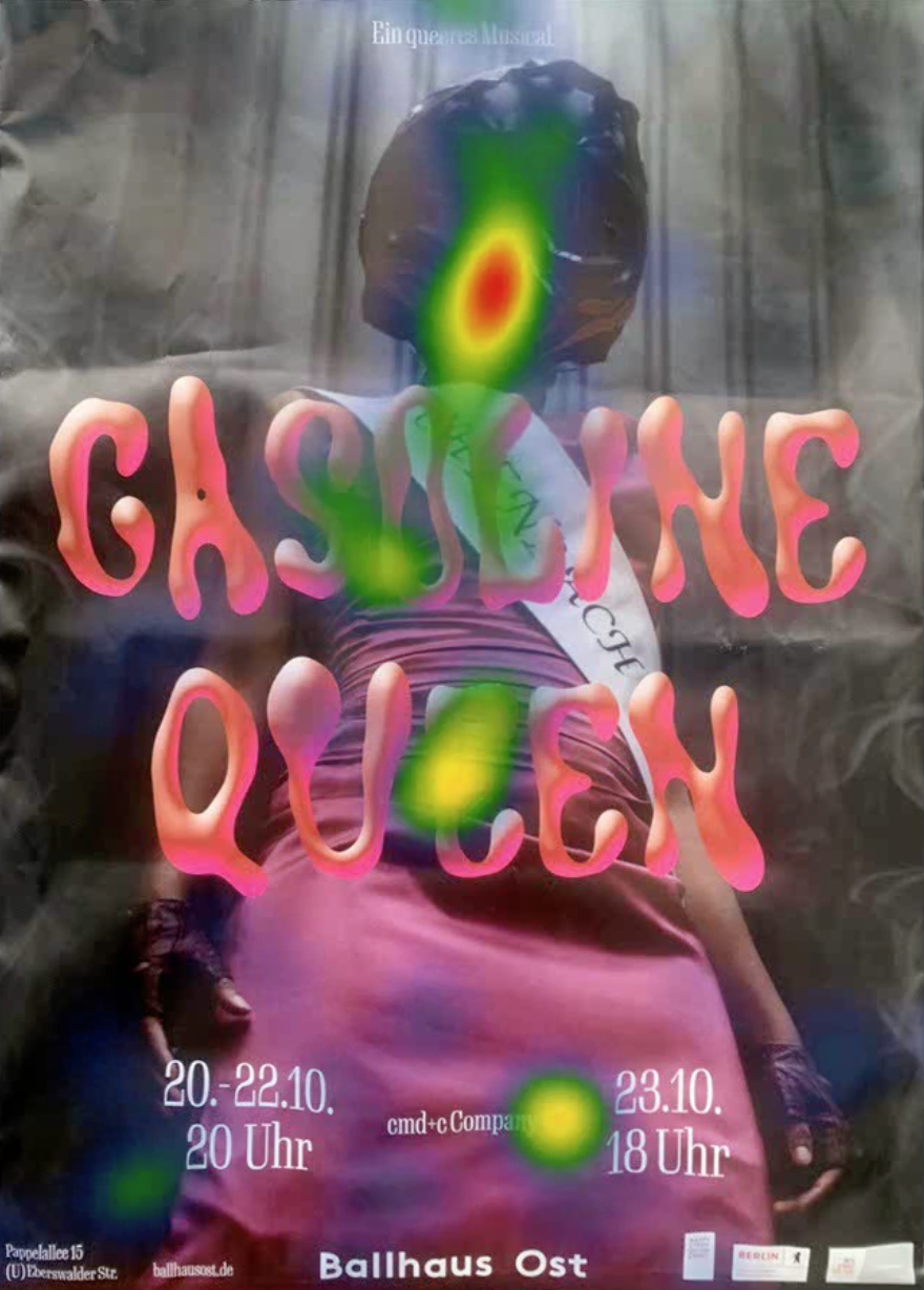
I used an eye tracker to determine where people focused their attention on the poster. Results showed that the participants looked at the font and the person's head first. Even though the person's face was covered by a helmet, it was still the most interesting part for most of the viewers (which I find to be a really interesting discovery).
These are the eye tracking experiments of three participants: This is a heatmap of the parts people looked at: