Modernism has relegated the idea of beauty to function, so “form follows function”. A commitment to “beauty” is seen as problematic. That design should not be about “beautifying” is a common statement. However, this very discourse of modernism has concealed that modernism is an aesthetic in itself!
Meanwhile, we as designers deal with aesthetic judgments all the time. Therefore, the first and most important task is to become more aware of our own aesthetic biases.
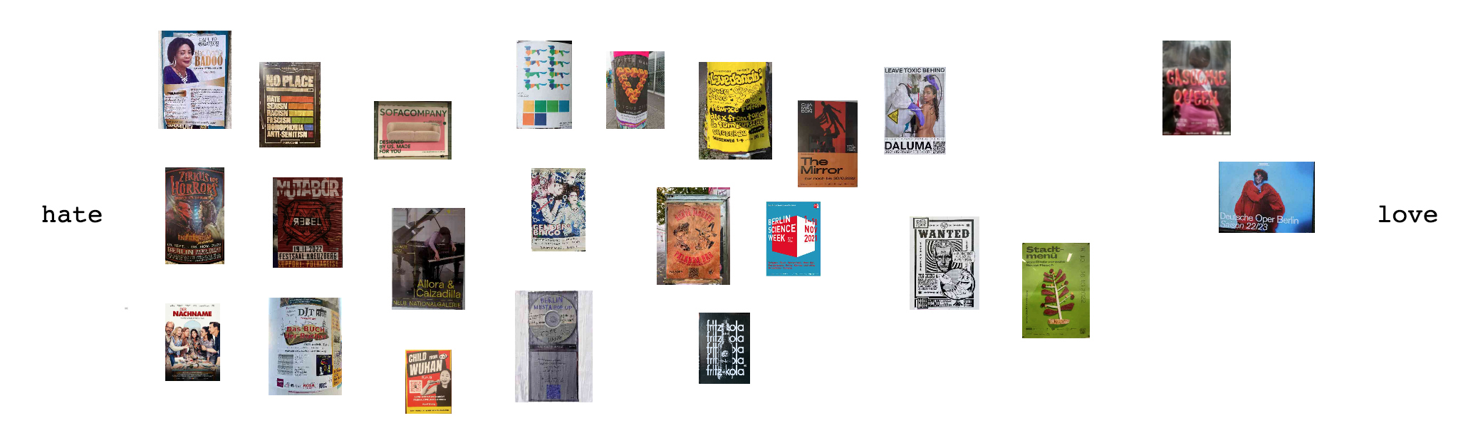
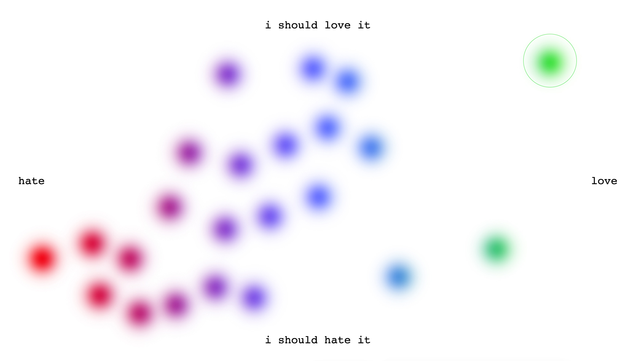
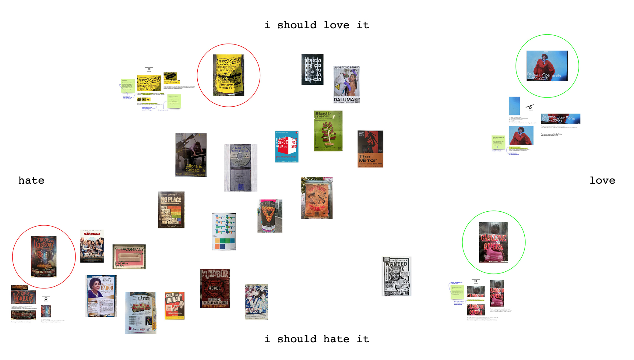
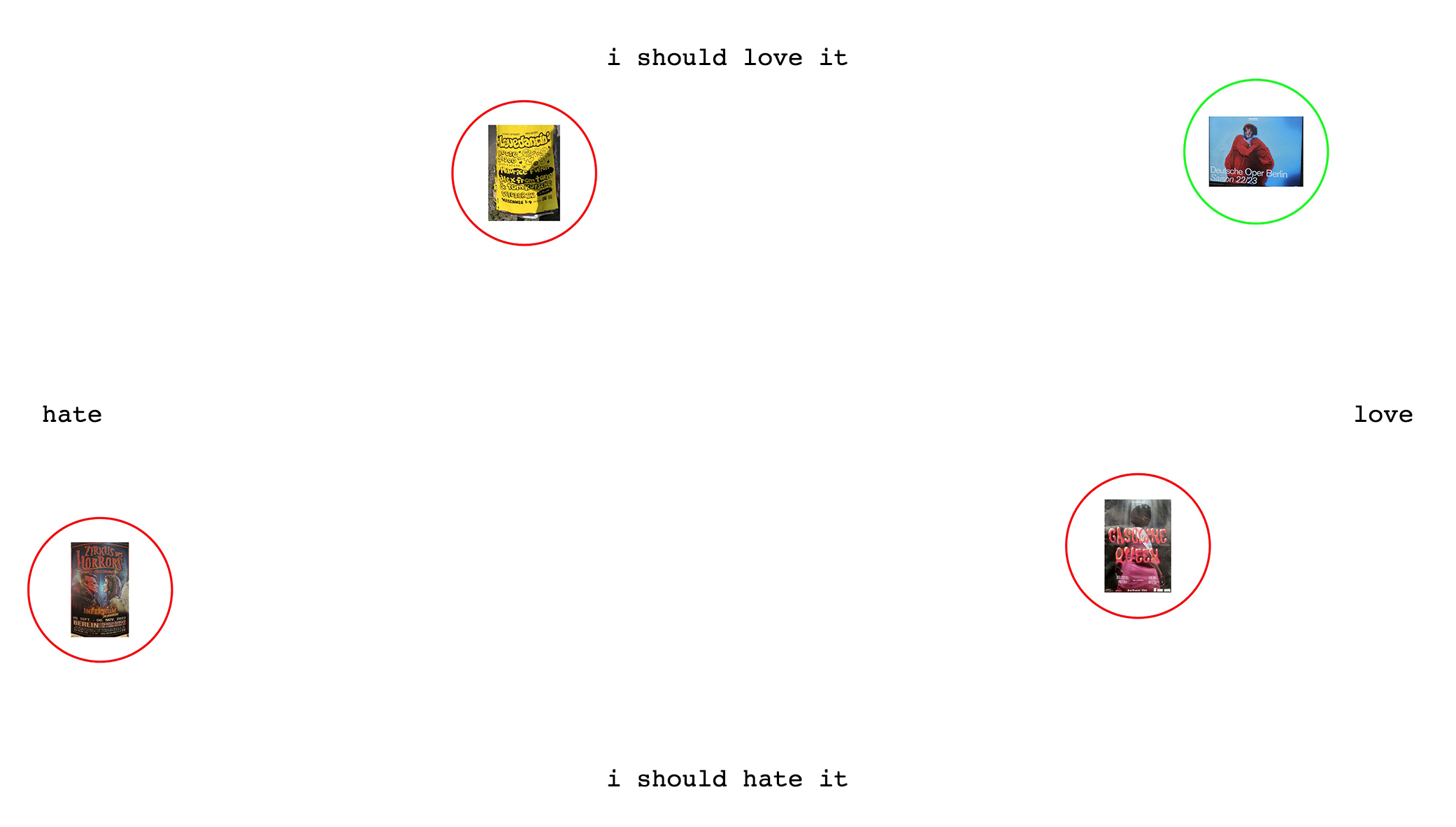
Looking at a different selection of posters, below is a simple x-axis diagram that goes from "love" to "hate". This is a judgment that was made relatively quickly based on subjective taste and pleasure.
It might be worth noting that taste and preference are sometimes not absolute. It is not always a hard yes or no. Looking at the below diagram, there is an in-between area that is quite stretched. Might this be because of the many factors that we judge a design based on? [Emotions, construction, meaning, aesthetics, etc.]
Also, is it easier to hate than it is to love?
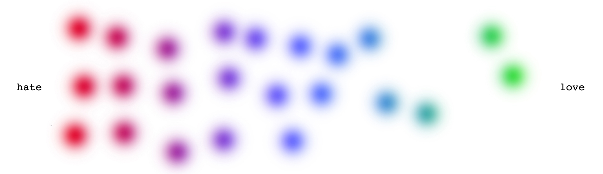
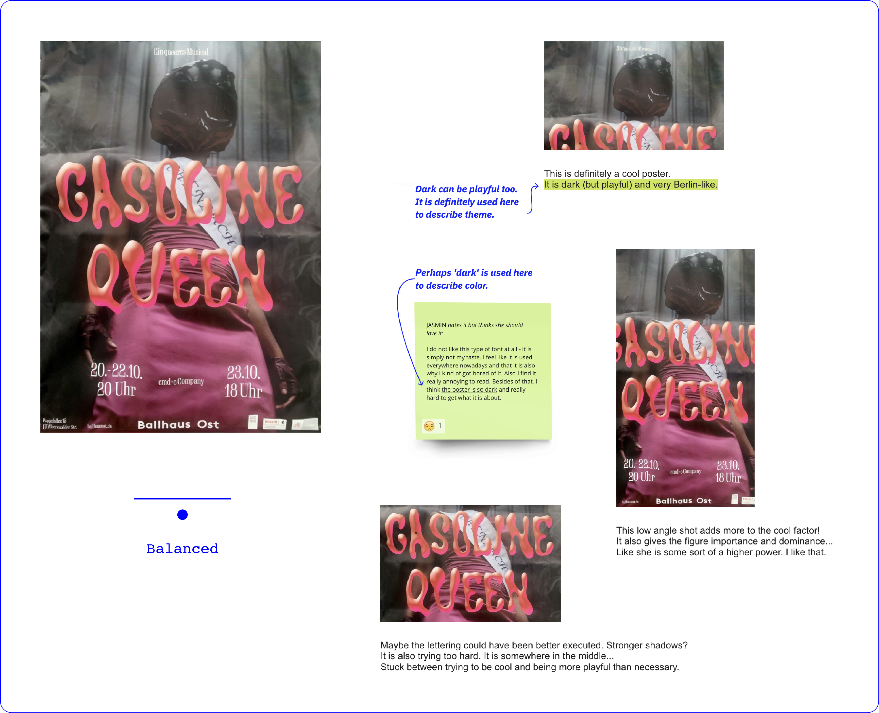
Taste is social. You cannot just love or hate anything. Depending on your class, status, profession you have to love and hate certain thing. The diagram below identifies some “good” tastes and some “guilty pleasures”.
Notice how the blotches of color become even more dispersed now. "Should" is the pressure to conform, to alter one's subjective preference based on observations of the surrounding opinion of what is acceptable and what is not.
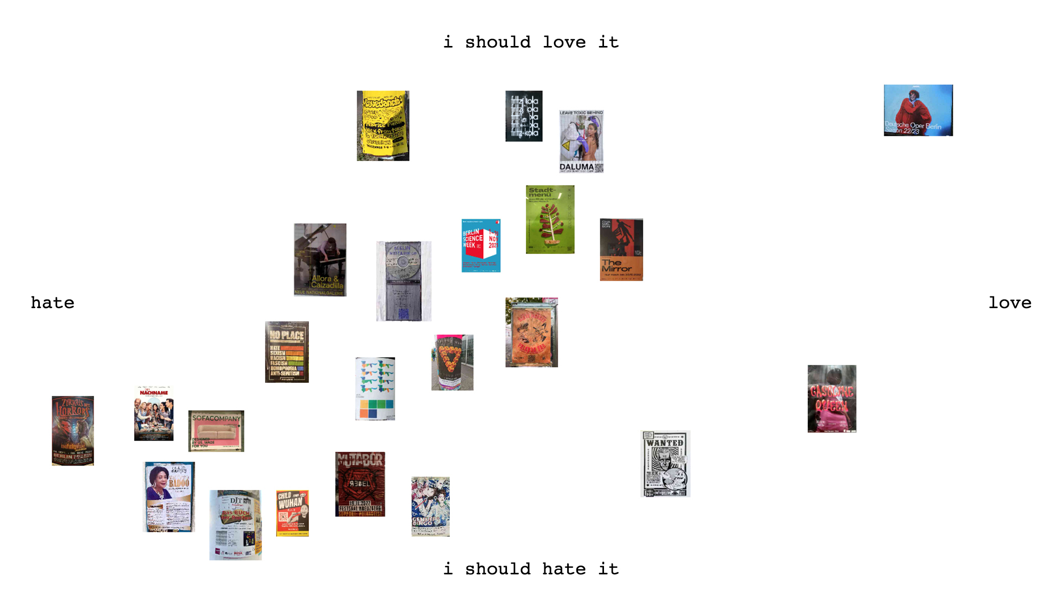
It makes me wonder... Was the prevalent love for the Deutsche Oper poster genuine? Or was it nothing but peer pressure?
Now we can more elaborately talk about what we love/hate here. I will be discussing the four posters on the extreme ends of the diagram.
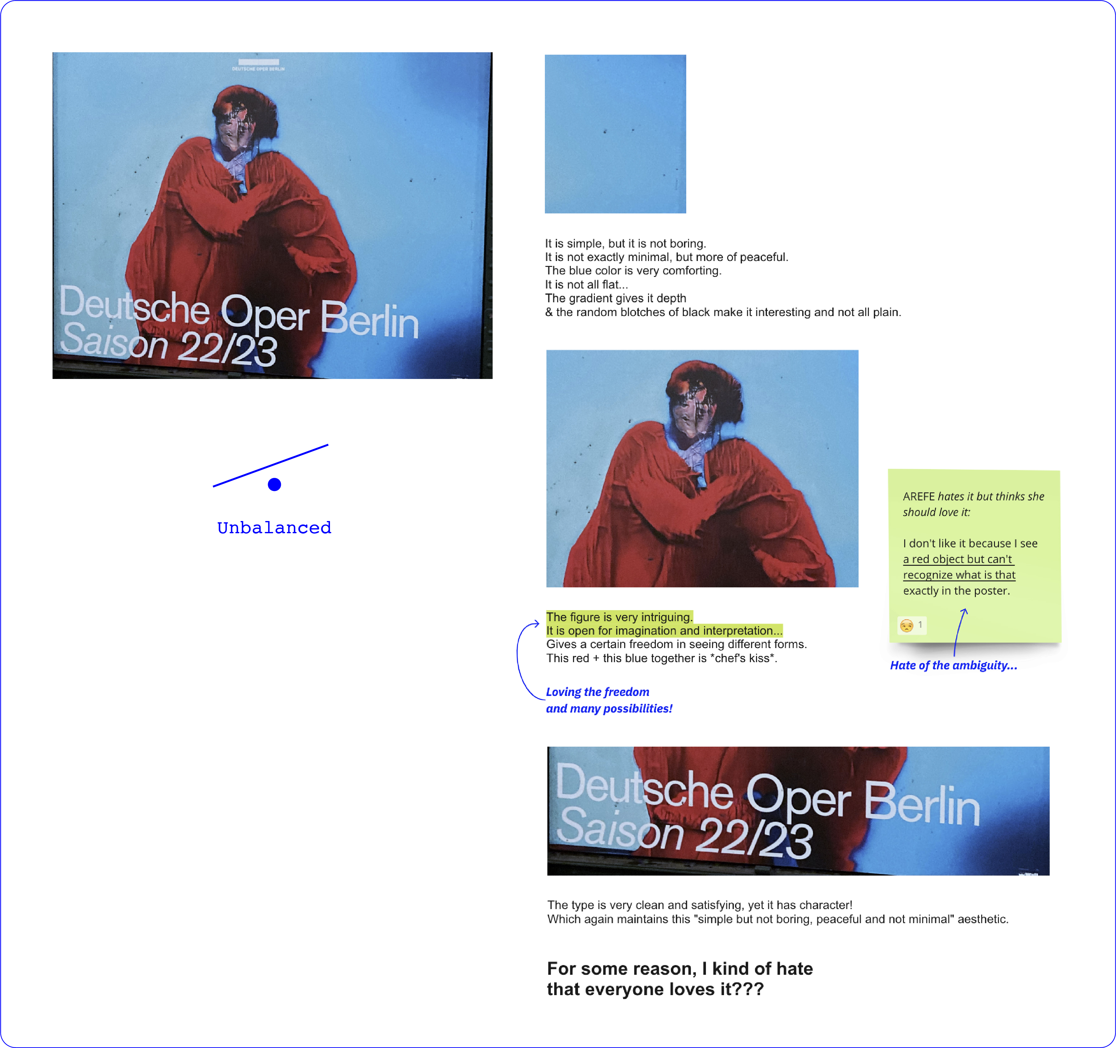
Checking from previous chapters: Is my poster good [in the sense of functional]?


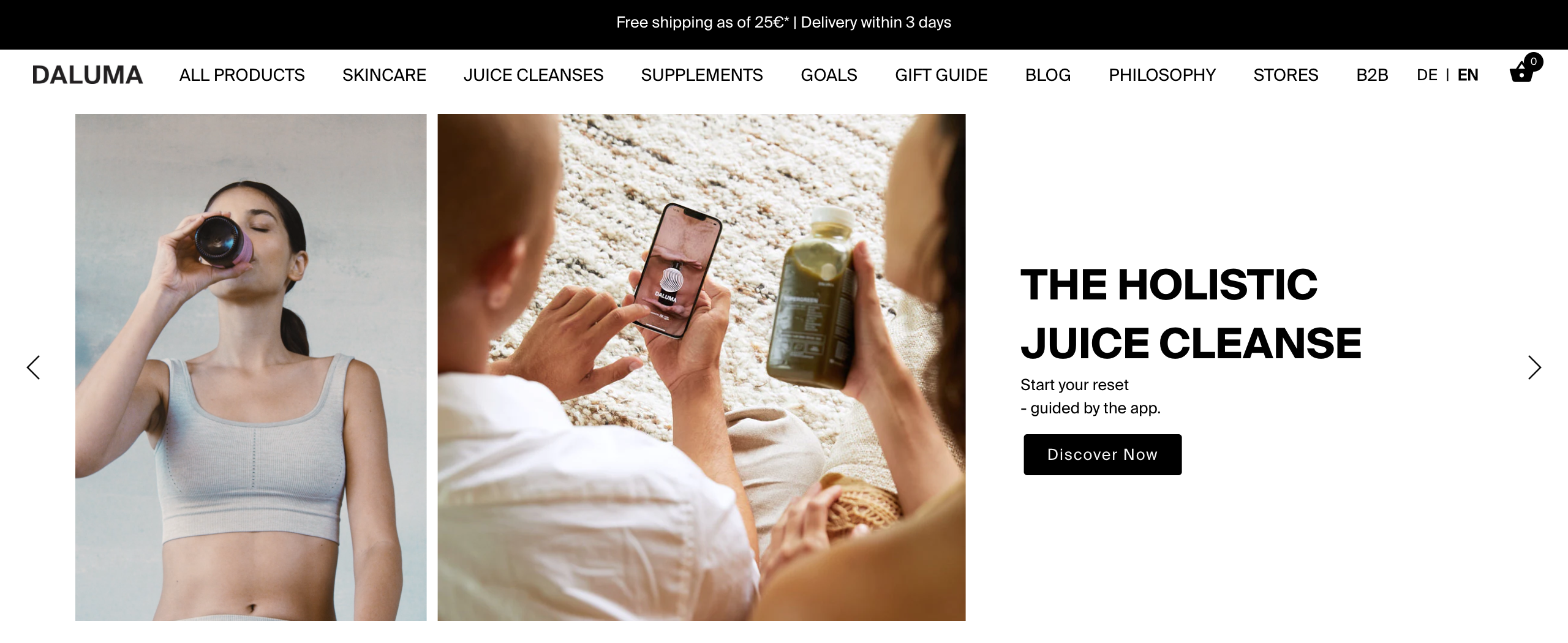
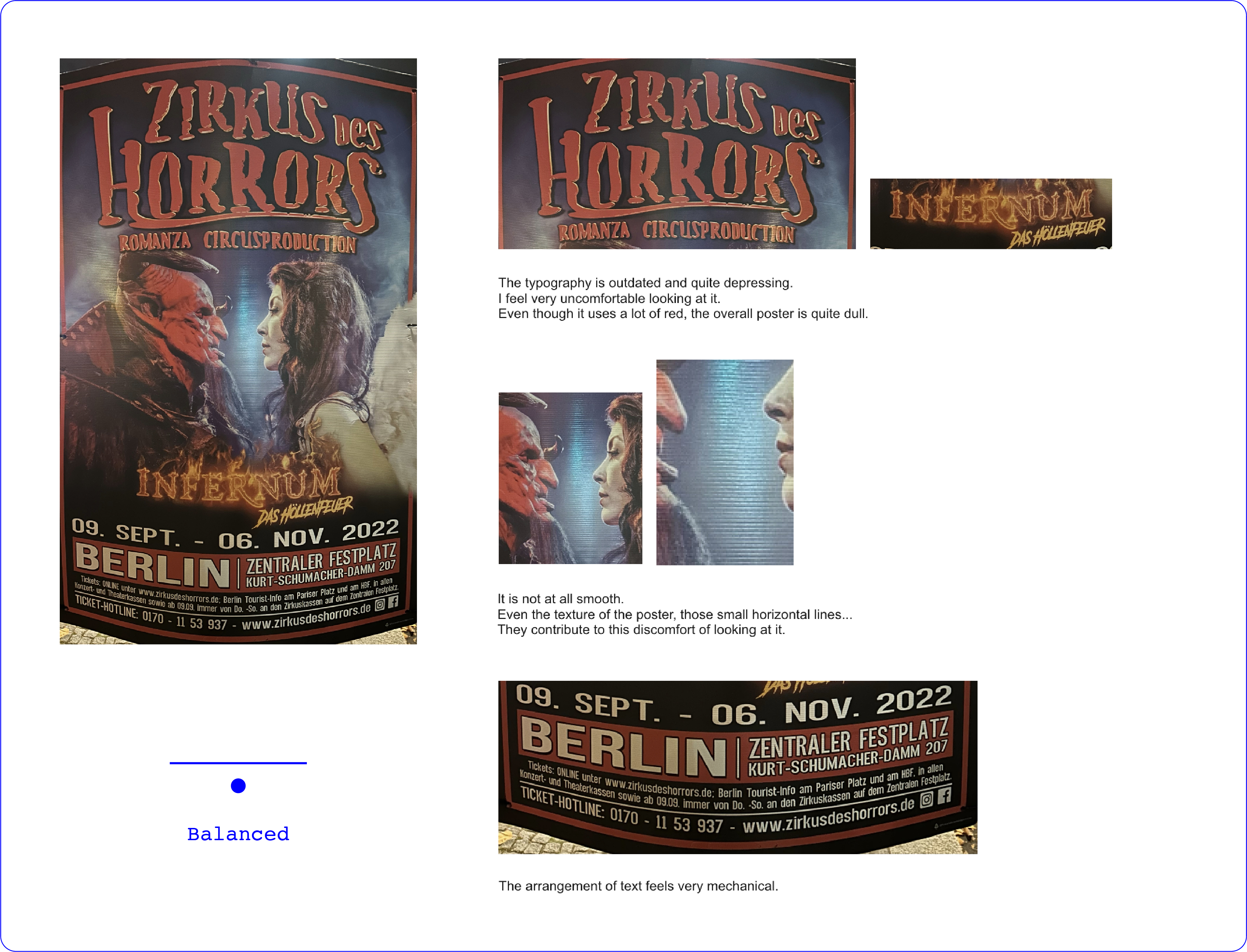
Overall, the poster is good. It gets attention [naked human] and it connects with a specific type of audience. But in terms of semiosis, it is not really possible to understand what it is trying to communicate. It has a very complicated way of telling the message.
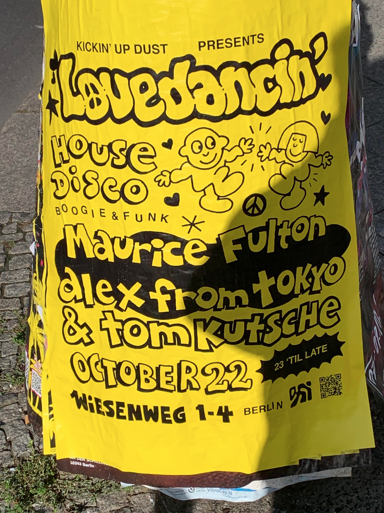
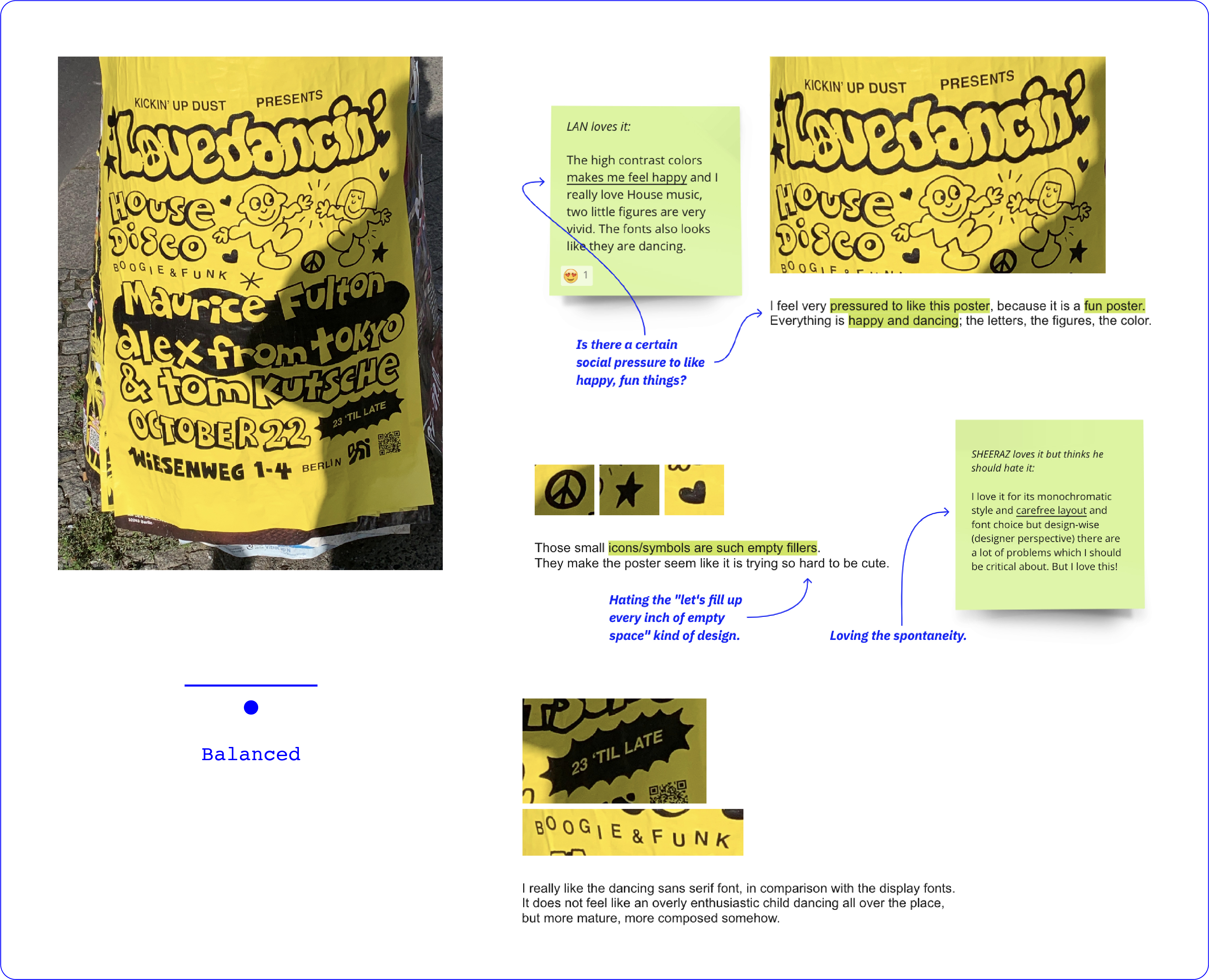
This is an example of a good poster that I hate. It very clearly communicates the message. It shows good contrast. There is a hierarchy to the presented information. It is yellow, happy, and lively; and somehow I hate it for that very same reason. That is a judgment made not based on technicalities but on style, mood, and subjective preference. It seems like our personal bias must always get in the way when looking at design.
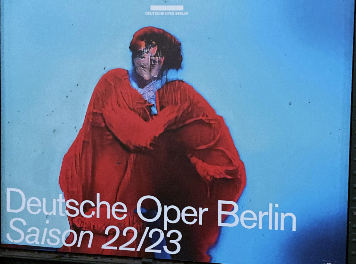
This is another example of a poster that I love, that everyone loves. All participants who have seen this poster agreed on it being a good one. I am one of those people, yet somehow I have started hating how much everyone loves it. Perhaps it is because I can sense peer pressure playing a role in judging the poster. Although it is not communicated, that is perhaps one of the reasons you feel like "you should love it".
Aesthetics in graphic design boils down to style…

The target group is even confirmed when checking the advertised brand in the poster, Daluma. One that follows a "holistic approach to self-care". This includes solutions for skin care, supplements, and liquids. And "self-care" is a term that is usually common among the more recent generations.