We now analyze graphic design as a composition of signs that conveys meaning.
Communication occurs not only through what we read but also through what we see. Visual rhetoric explains how the use of images — including photography, illustrations, colors, fonts, arrangement of elements, etc. — provides us with information, communicates meaning, and even persuades the viewer. Naturally, visual rhetoric is closely linked to semiosis, the production of meaning through signs.
In this poster, we will look at the visual signs and the meanings they produce. So we ask ourselves the following questions: What do we see? How is the meaning conveyed through what we see?
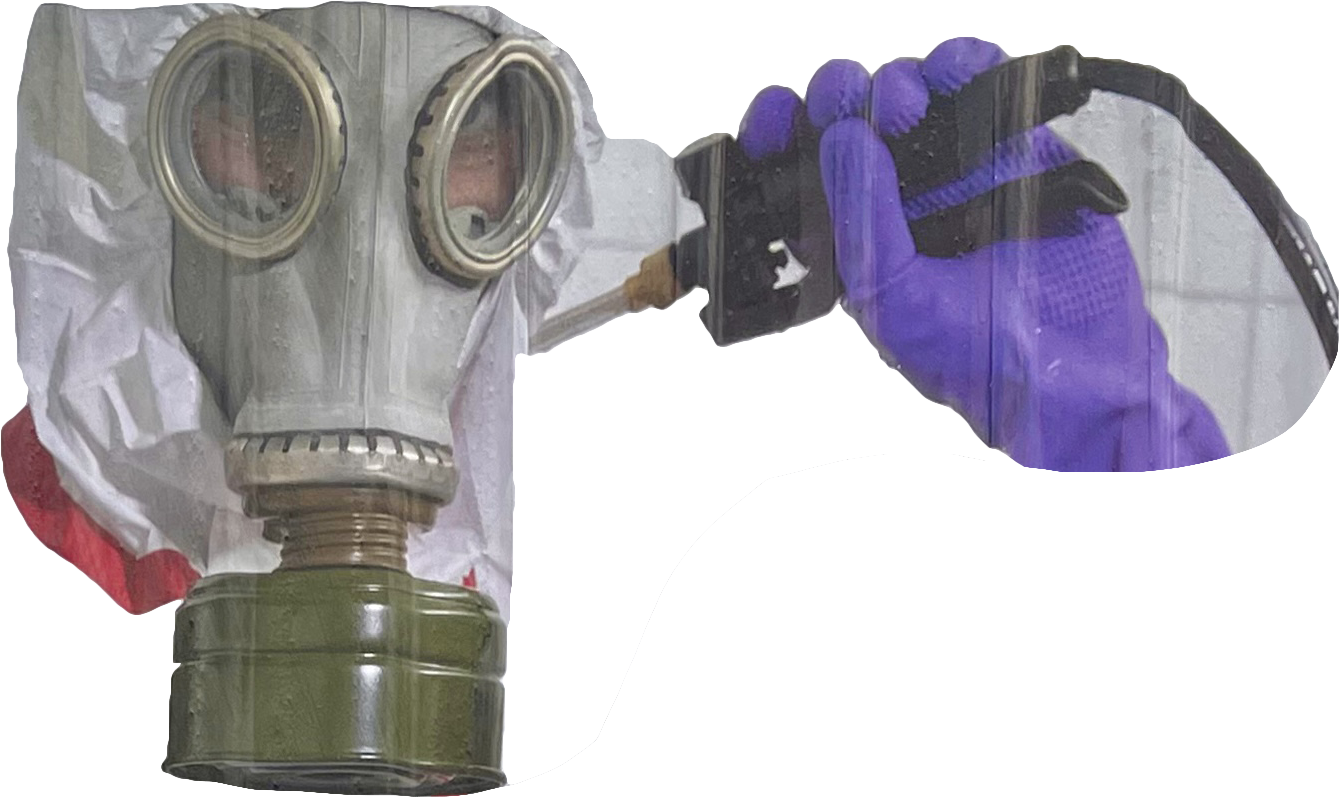
A very strange feeling sets in upon looking at this image. You do not quite understand what is happening, but something feels wrong — perhaps a feeling of “This woman needs my help” takes over. This feeling is facilitated by:
Looking at the male figure’s attire; he is fully protected, while she is standing nude. The man in the poster is wearing an all-white full-body suit, a gas mask, rubber gloves, and has a ‘dangerous’ tool in hand. The gas mask alone, an index, is directly connected in our heads to both war and medicine/disease, which already triggers a sense of danger in the viewer. This is also stressed on earlier in the Tachistoscope experiment where one participant suggested that the figures are “at a lab” going through some “testing situation”.
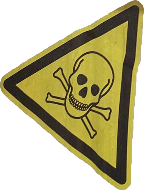


The word “toxic” is repeated 3 times [in addition to being referred to with the pictogram and the overall photo]. Therefore, it can be said that this poster is a literal translation of the message it is trying to communicate, which might come off as unsophisticated. However, Daluma is a niche wellness/cosmetics brand targetting a young, up-to-date audience [Millennials and Gen Z], who are well acquainted with the term “toxic relationship” and find it very relevant.
The elements hardly work together in terms of functionality. Upon first glance, maybe second and third too, it is unclear what this poster is about. I was surprised myself to know it is a wellness/cosmetics brand. But this poster is more to attract than to inform. The image on its own makes you curious, gives you a strange feeling, but that’s about it.
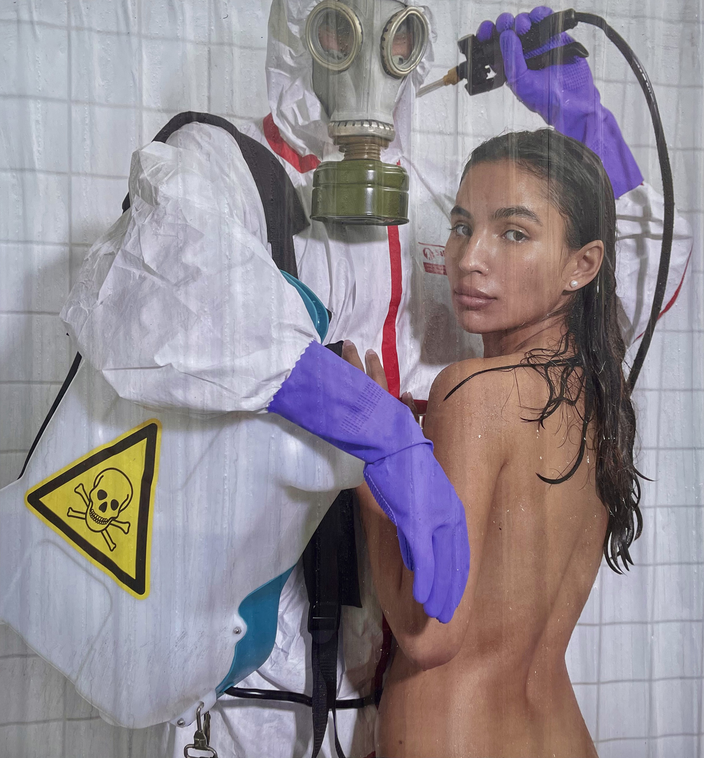
This peculiar feeling becomes more undeniable when you read the word “toxic” over and over again. Hence, the text here enhances a feeling and is even repeated 3 times to build that feeling up to the maximum.
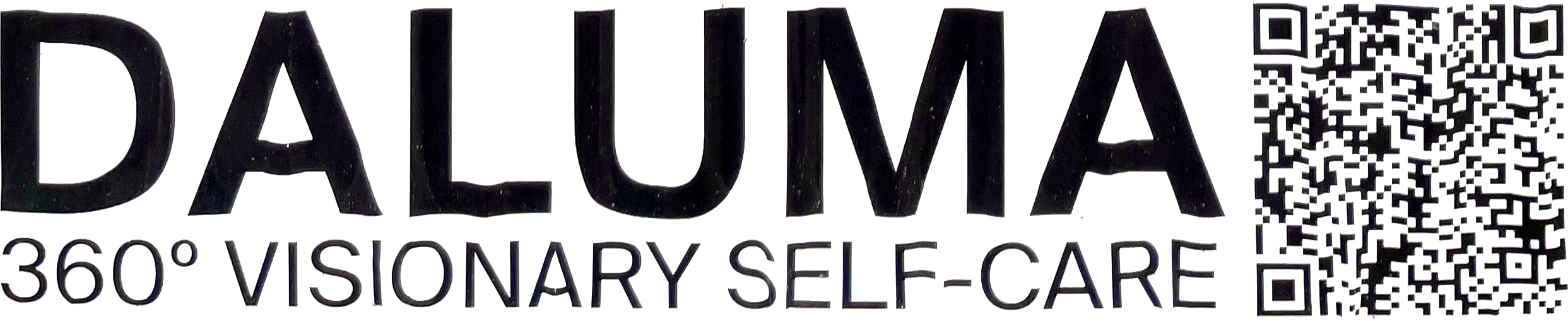
You see an unfamiliar name “Daluma” and a slogan with the word “self-care” in there and you understand that there is more to it. This is when an insinuation about a brand/product is made. It is even the biggest font on the poster because it is meant to inform the viewer of the advertised brand, which is very difficult to predict from merely the image and descriptive text. Another layer is the QR code which is the most obvious link to the brand; perhaps without it, the viewer would never know what is being advertised.