We are now finally and surely in society with our poster! How does society shape it and how does the poster "actively"
take part in society?
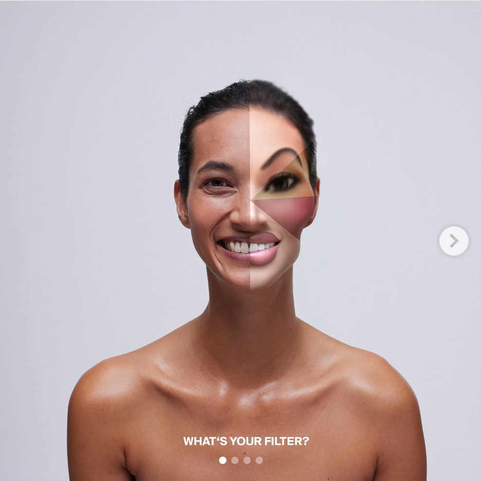
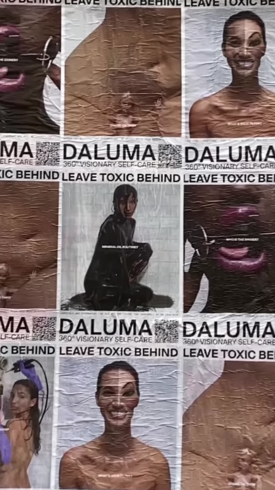
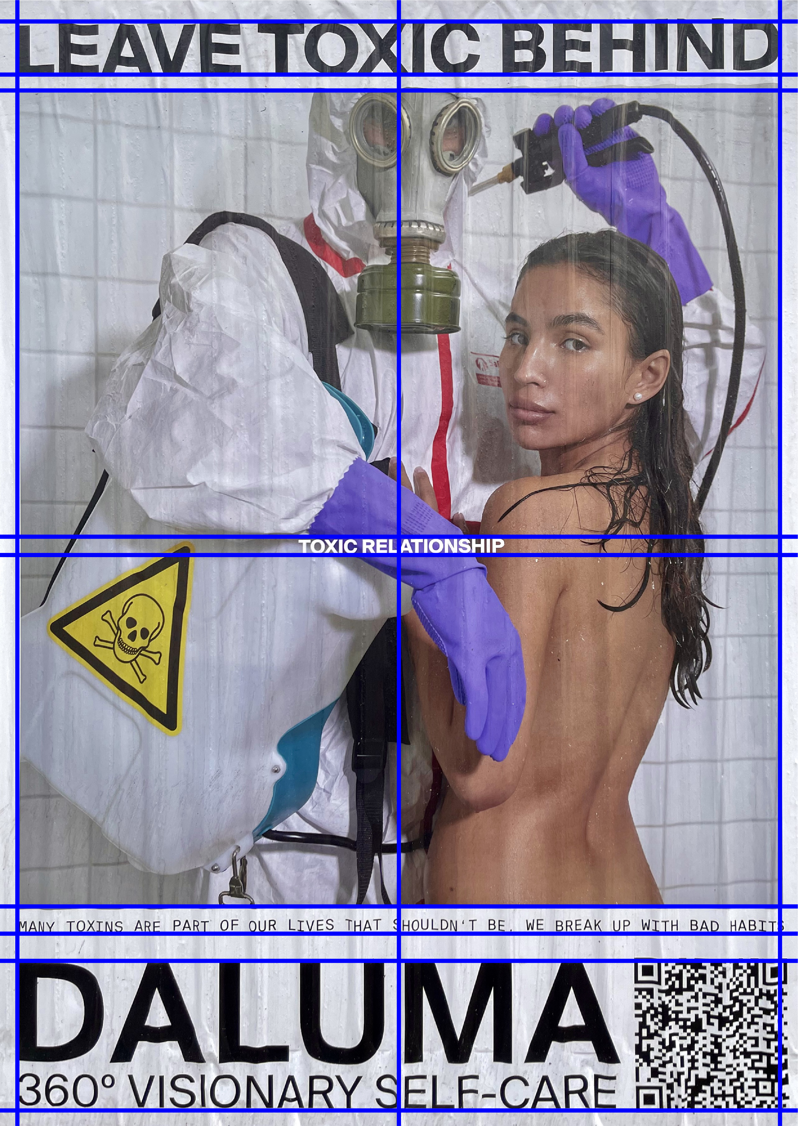
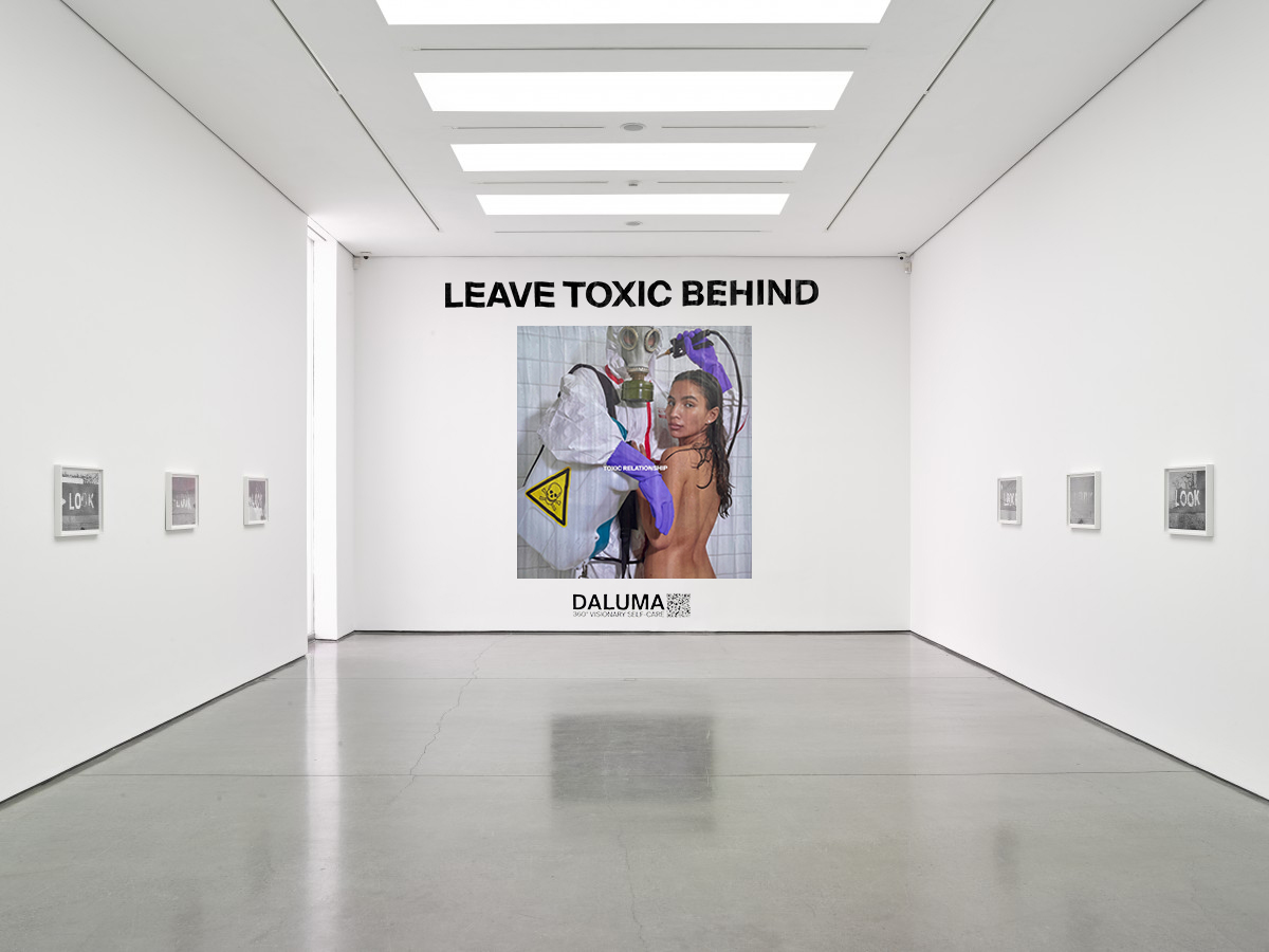
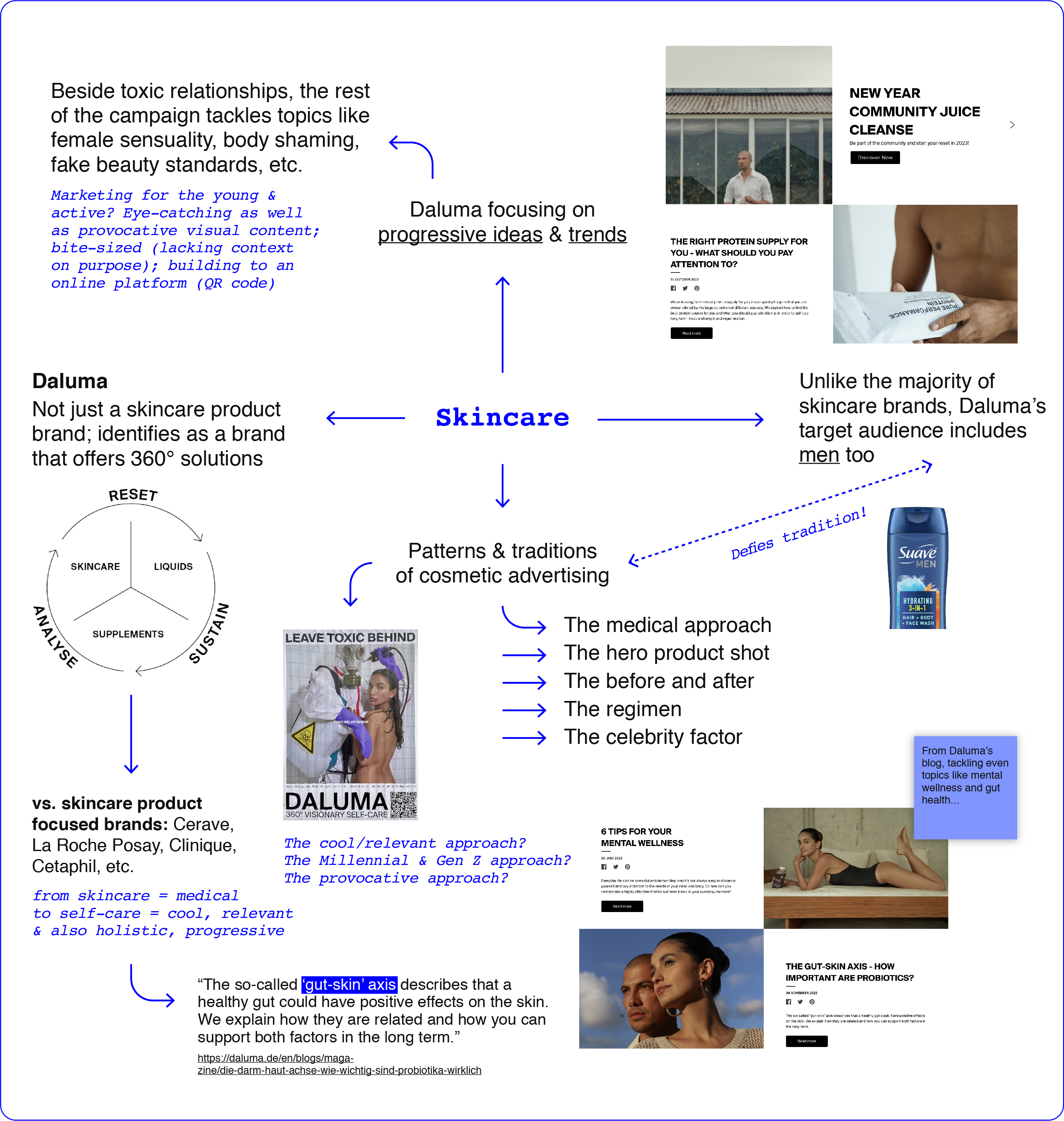
This poster was designed as part of a campaign titled "Leave Toxic Behind" by Daluma to promote their skincare
products as well as offer routine and habit-building advice for healthy, glowy, dewy skin. The campaign includes some
"holistic skincare weeks" of expert talks and fitness classes, from September 26th, 2022 to November 27th,
2022.
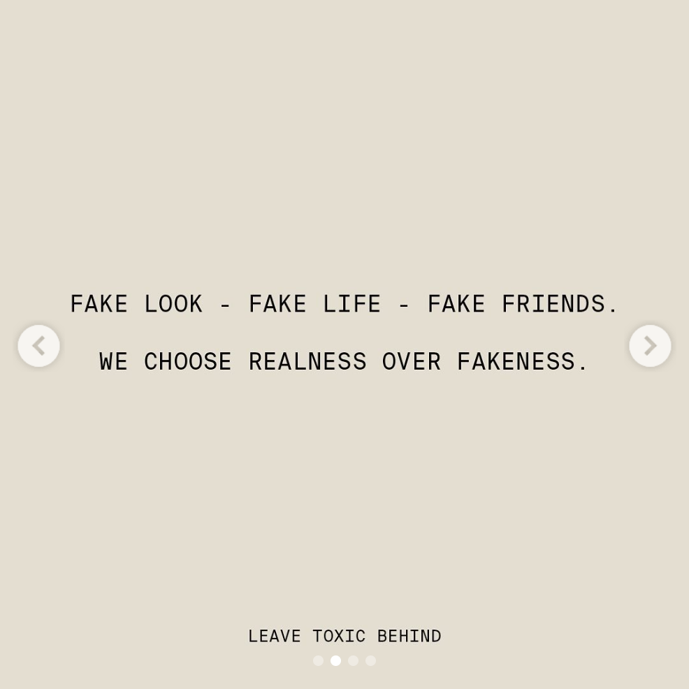
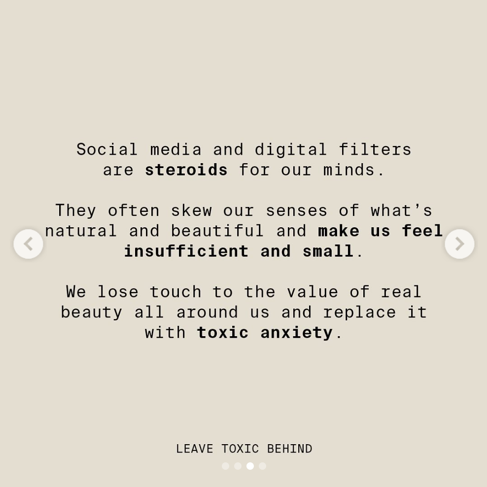
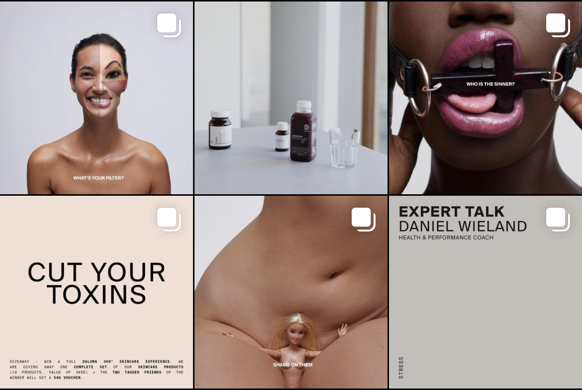
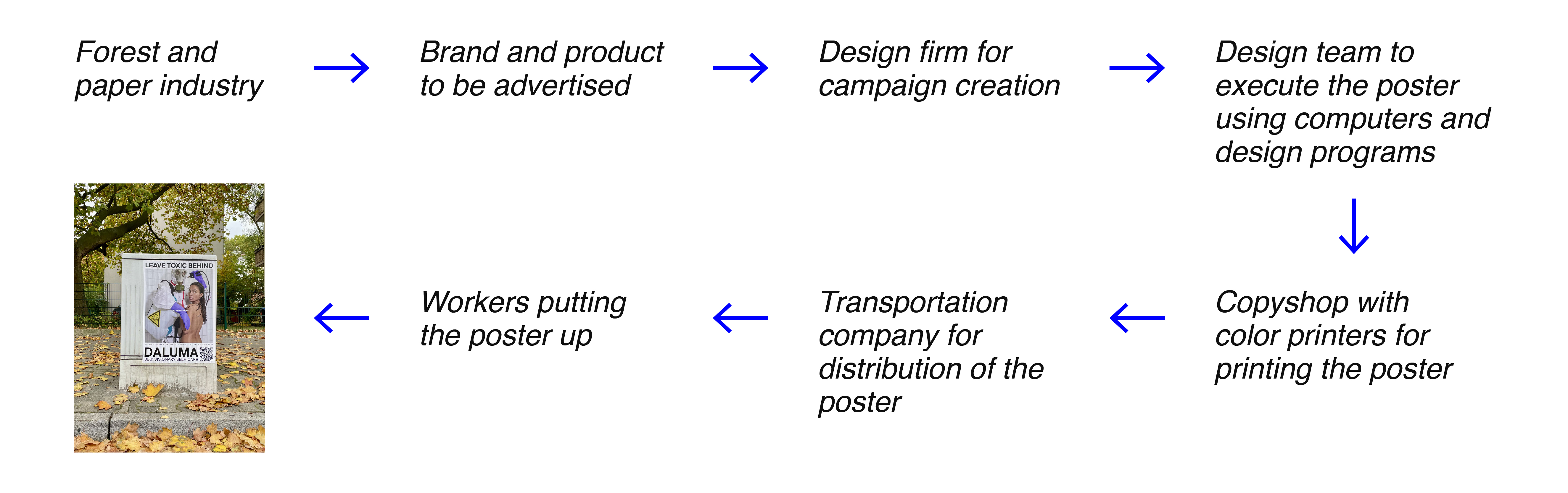
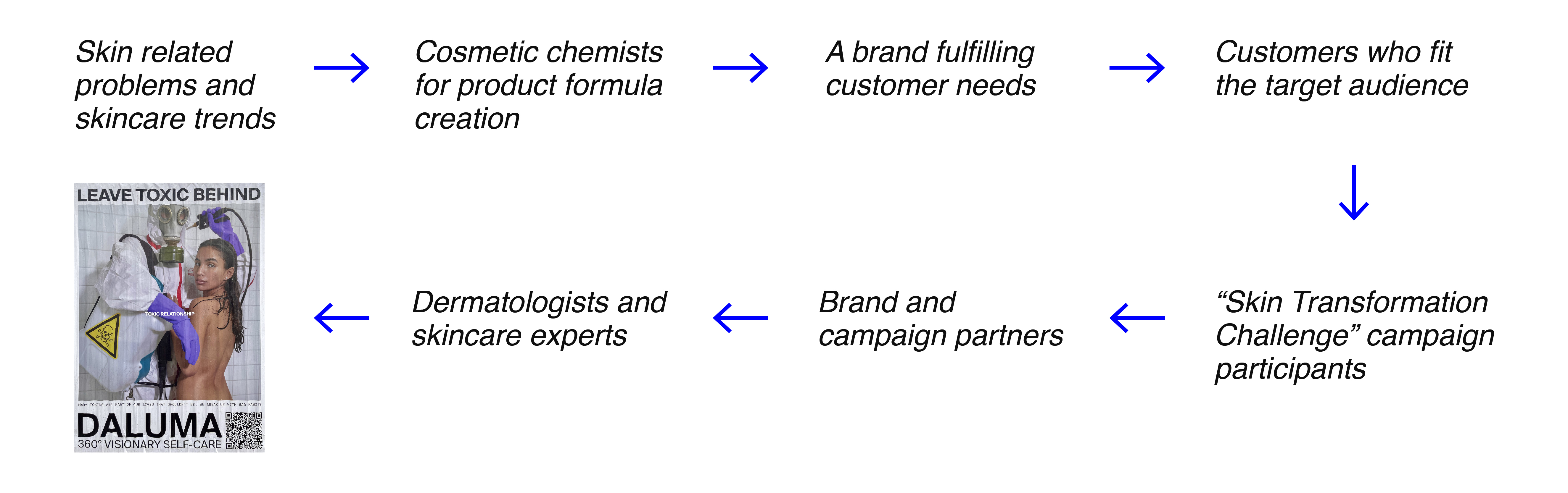
 From the rest of the campaign of "Leave Toxic Behind"
6.2 Who designed this for whom?
The client is the brand itself, Daluma, partnering up with Vogue, Staatsoper Unter den Linden, Eterno, and Arive.
However, the designer remains unknown.
6.3 What technique was used?
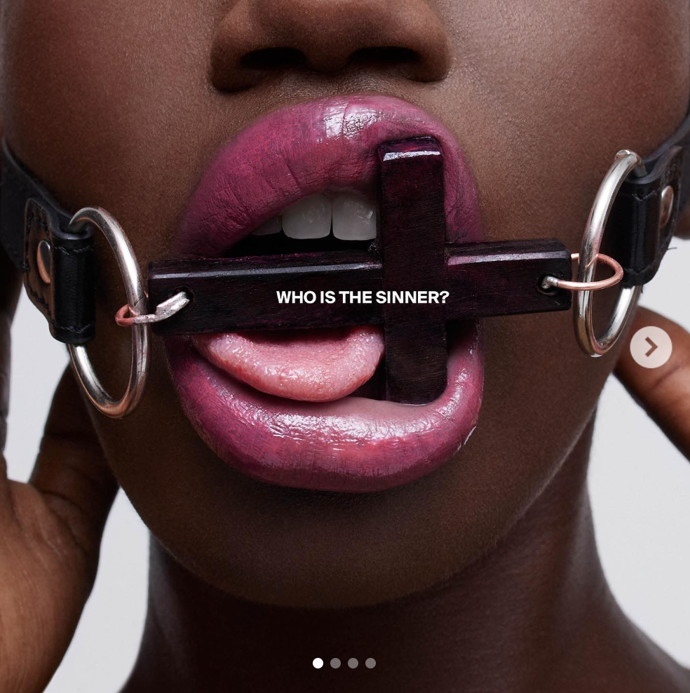
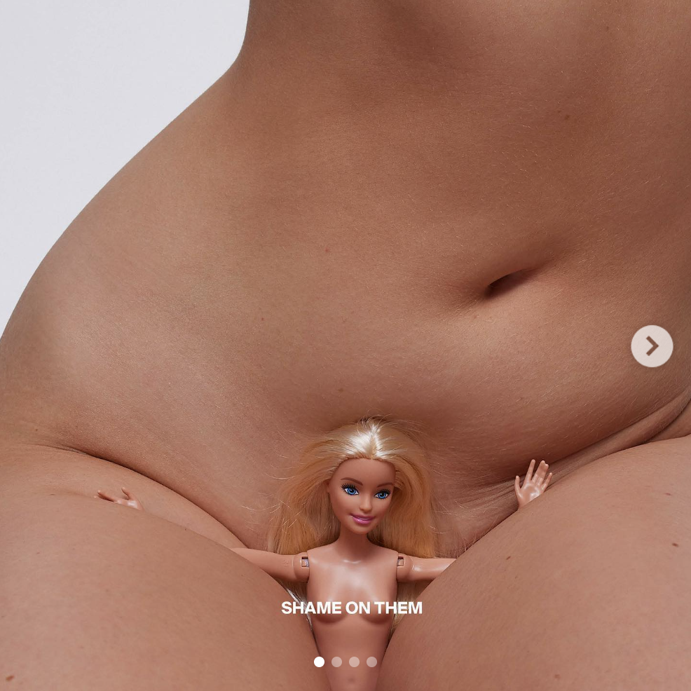
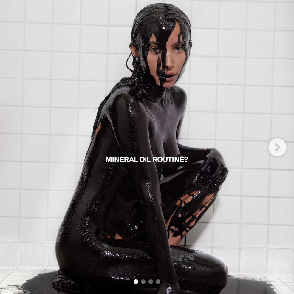
The poster simply consists of an image, some text, and a QR code. The images look staged, most likely professionally
photographed in a studio. Some of the images appear to be edited in terms of light and color, but it does not look like
heavy photoshopping was involved. As already mentioned before, the poster uses the famous Helvetica. Using a program
like Adobe InDesign, the images and text are combined. Finally, the QR code was generated, perhaps using an online QR
code generator, taking the viewer to the brand's website when scanned.
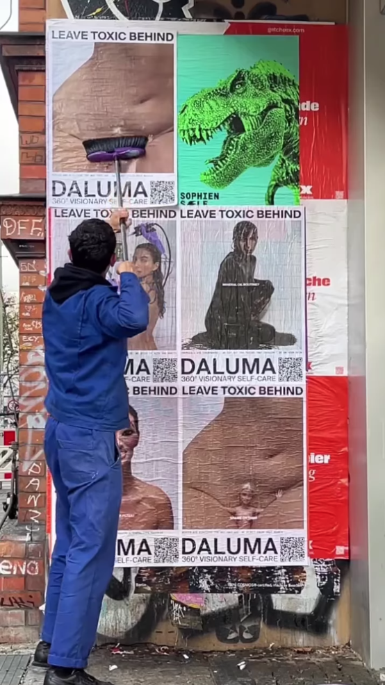
The posters were produced to be published both in a digital format
[for online usages, like Instagram]...
And in print [as posters on the street], where offset printing was used...
6.4 To which style does this refer?
In terms of style, two reference points come to mind when looking at this poster: Swiss Design and the White Cube
concept.
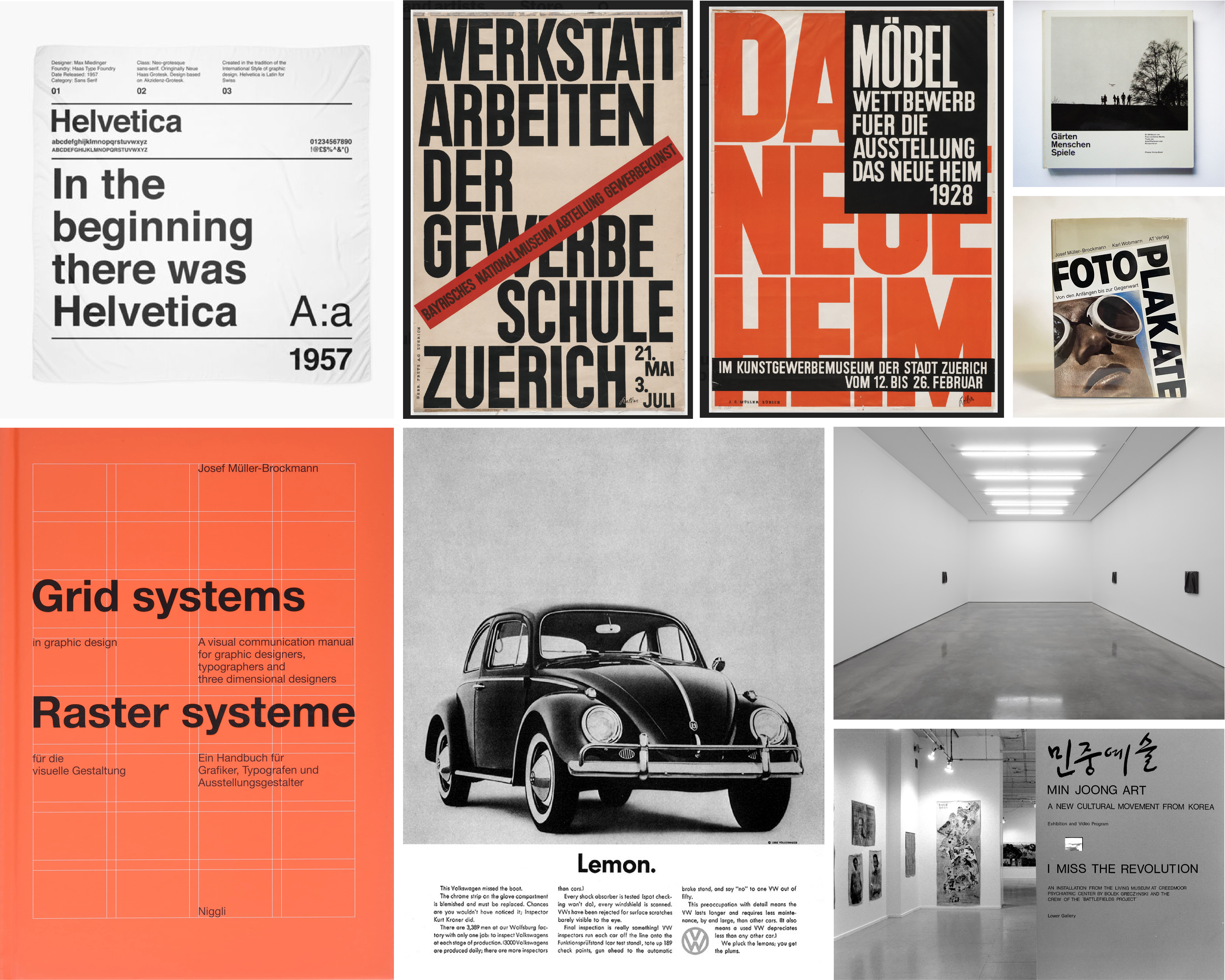
1. Swiss design
Swiss design can be defined by its use of crisp, blocky layouts, a minimalist design approach, and sans serif typefaces.
Of course, we see Helvetica loud and clear in the poster. And although Swiss design appeared far earlier, for many
people, Swiss design is synonymous with Helvetica. This is no surprise since Helvetica was strongly influenced by
earlier created Berthold typefaces like Akzidenz Grotesk, which initially represented Swiss design before Helvetica made
an appearance.

Other things that distinguish Swiss design, all of which can be found on my poster:
↠ The use of mathematically determined grid
↠ Using photographs more than illustrations
↠ Using images not to sell, but to tell a story
↠ Lots of white space
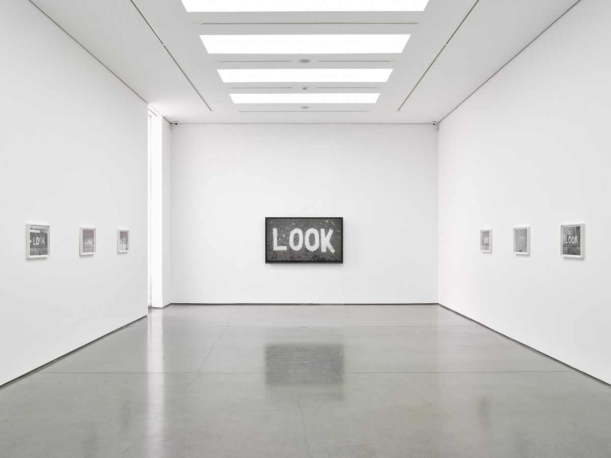
2. The white cube concept
Then comes the white cube concept, a term created by art critic and artist Brian O’Derthy. The idea behind the white
cube is to experience art in a neutral space without any kind of aesthetic, distraction, or context. I think there might
be a resemblance between the white cube and the poster. Like the white cube, my poster here is very clean and organized;
even feels sterile as all modern art galleries do. The poster in its entirety acts like a white cube gallery, while the
image is the artwork put on display and the text is the description of it.
I wonder if this was the intention during execution, and if so, I wonder why. Do they know that if you want to address
people, you need to hide the advertisement? Perhaps they wanted to create a story and not an ad. So, is it because
anything placed inside the white cube turns miraculously into art?
6.5 What is the socio-cultural precondition for this?
How can the poster be existent at all?
How can the promoted brand/campaign exist? What and who is needed?
6.6 What is the discourse?
Before getting into the analysis, I would like to really understand and define discourse here because no matter how many
times it has been explained to me, I fail to fully comprehend it. [Sorry, Prof. Raff.] What I understand is
that discourse transcends language, going beyond the literal meaning of words. Discourse examines the general and
underlying meanings expressed by language in context. This “context” points to social, political, cultural and
historical aspects of the topic. What I am going to conduct is a discourse analysis that investigates my poster and the
topic it presents, putting into consideration the four aspects of the discourse mentioned earlier.
Firstly, let's look at the poster from an outsider’s point of view. The poster clearly assumes the advertised brand and
products to be understood when they are really, really not. As an outsider, would you be able to tell that this is a
skincare and wellness brand? No matter how educated and up-to-date you are, you can almost never guess. You probably
have to scan the QR code to get a general idea of what this poster is about, then maybe navigate a bit through the
website to fully comprehend what the brand offers [since it is more than just skincare products]. I had a "wow" moment
upon realizing it.
This "wow" moment does not occur when looking at other cosmetic ads. Why? Because we know what to expect. Historically
and socially speaking, there are well-recognized patterns and traditions in advertising cosmetic products that this
poster does not confine to, which is perhaps partially why we fail to understand what it is about. [On a related note,
breaking free from tradition is not the problem, but lacking functionality only for the sake of freshness and novelty
might be. So, where does this poster stand?]
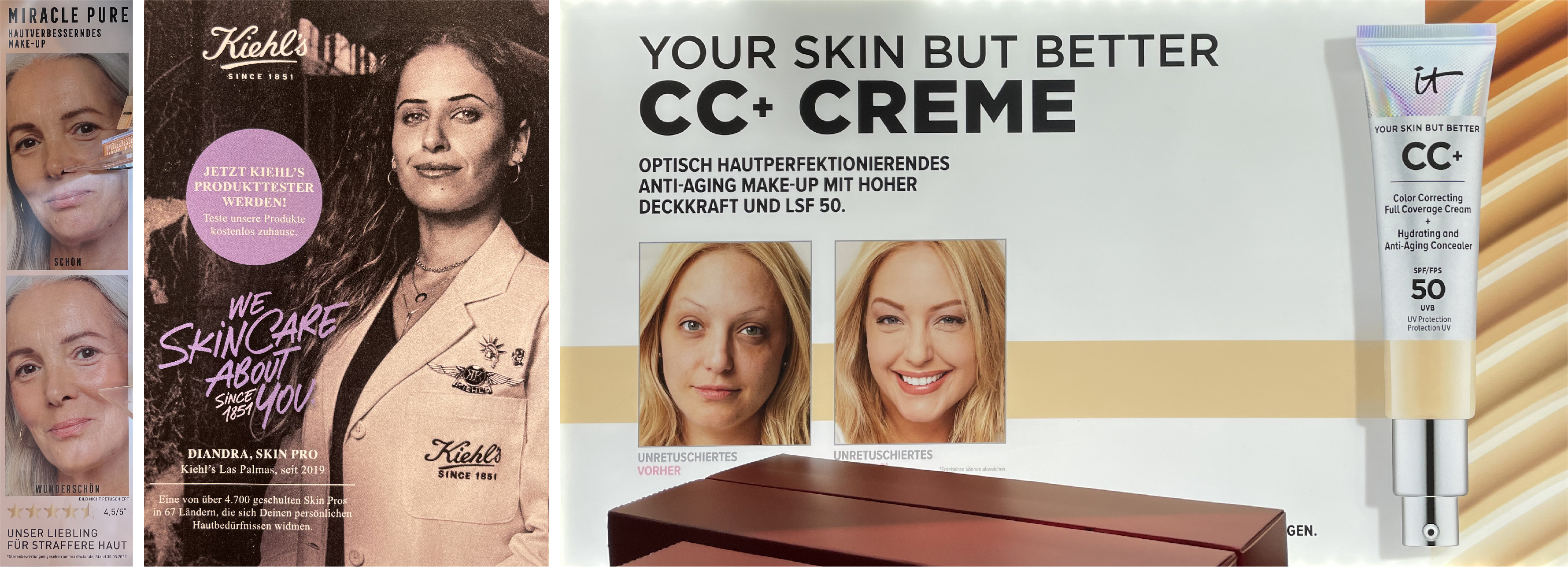
As shown below in the mindmap, types of cosmetic advertising include the medical approach, the hero product shot, the
before and after, the regimen, and the celebrity factor. None of which Daluma's ad belongs to. Where does Daluma choose
to set foot? What does it want to say? It wants to say...
"I'm different! I'm cool, young and relevant!
I'm progressive! I'm also professional! I'm holistic!"
Beside the wide array of product types [skincare, liquids and supplements] provided by Daluma and the unconventional
advertising, how else does Daluma defy tradition? Unlike the majority of cosmetic brands, Daluma targets men too. In addition,
it also tackles topics like mental wellness and gut health, claiming that good skin cannot be achieved only from the outside
but from within too.
Now, how does the public feel about this topic of beauty and wellness? When it comes to cosmetics, people want to be
convinced of their effectiveness. It is not the brand that makes the effort here, but the public. People would do
anything to feel convinced, to believe in an effect, to trust a product's promise. How do highly acclaimed brands
normally facilitate this? By displaying direct effect, by showing skin, by making comparisons, by being crystal clear,
by sticking to tradition.
So the question is, did defying tradition here in this poster lead to a lack
of functionality? Maybe. But I think even this lack of functionality was purposely designed to fit the target
audience. After conducting the discourse analysis, it can be noted that Daluma's campaign focuses on progressive ideas
and trends, marketing for the young and active. This is not only achieved through eye-catching, provocative visuals
but also through bite-sized content. [Yes, even print can be bite-sized.]
This lack of context [intensified by an intriguing theme] paired with a QR code, building to an online platform
[where you can do online purchasing] seems to be exactly what a brand like Daluma wants.