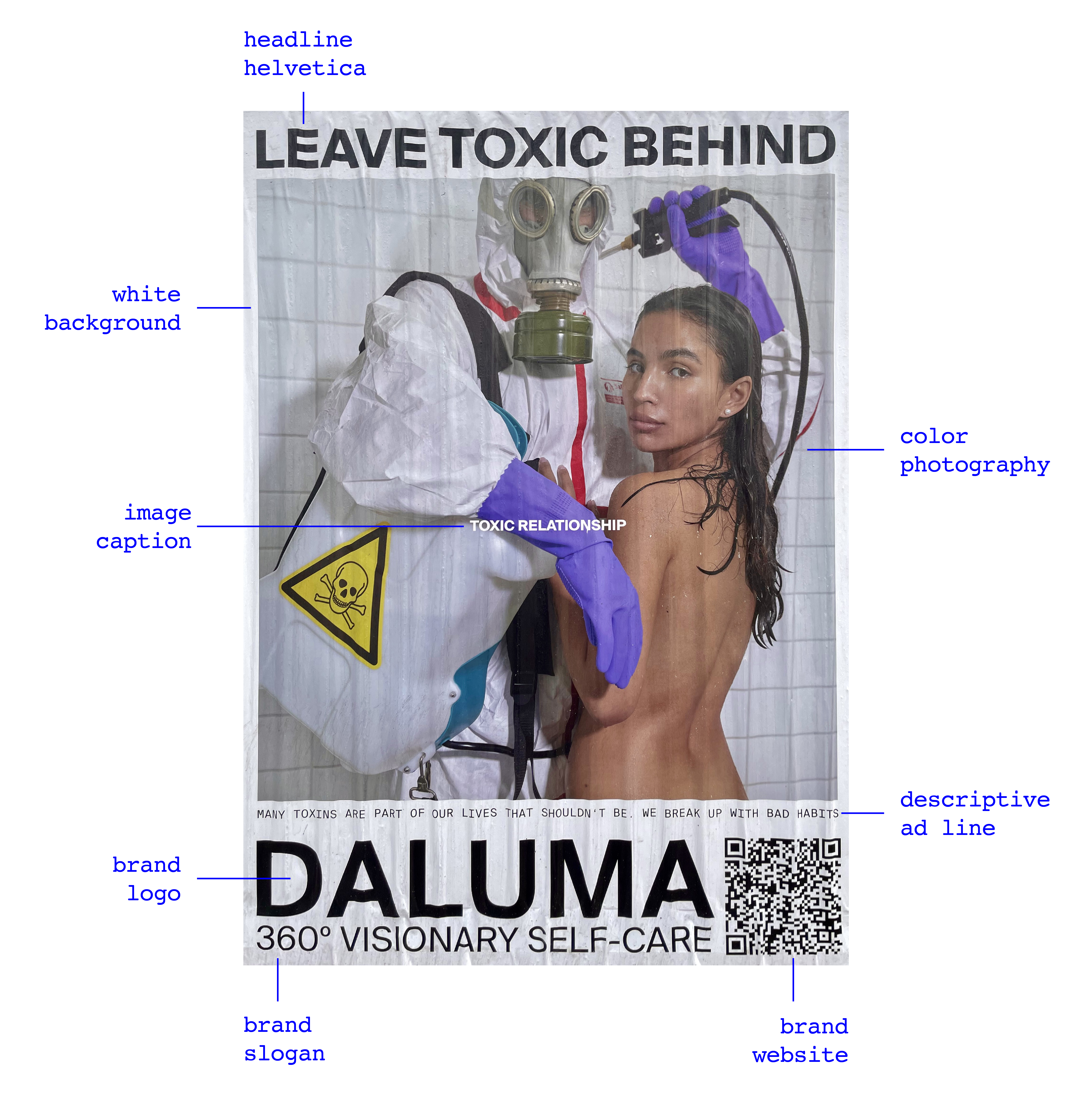
This is about the visual assembly of the poster, what it is made of; how it is built, including format, grid, and composition; and what meanings can be found in such a structure. Understanding the construction of a poster begins with de-construction, taking away, looking closely, and analyzing.
The poster is of a vertical format, which is obviously followed by the way the elements are stacked in almost cubical spaces on top of each other. But what the format perhaps forces most is the image, which has enough vertical space in the poster to be dominant and to show the figures almost fully.

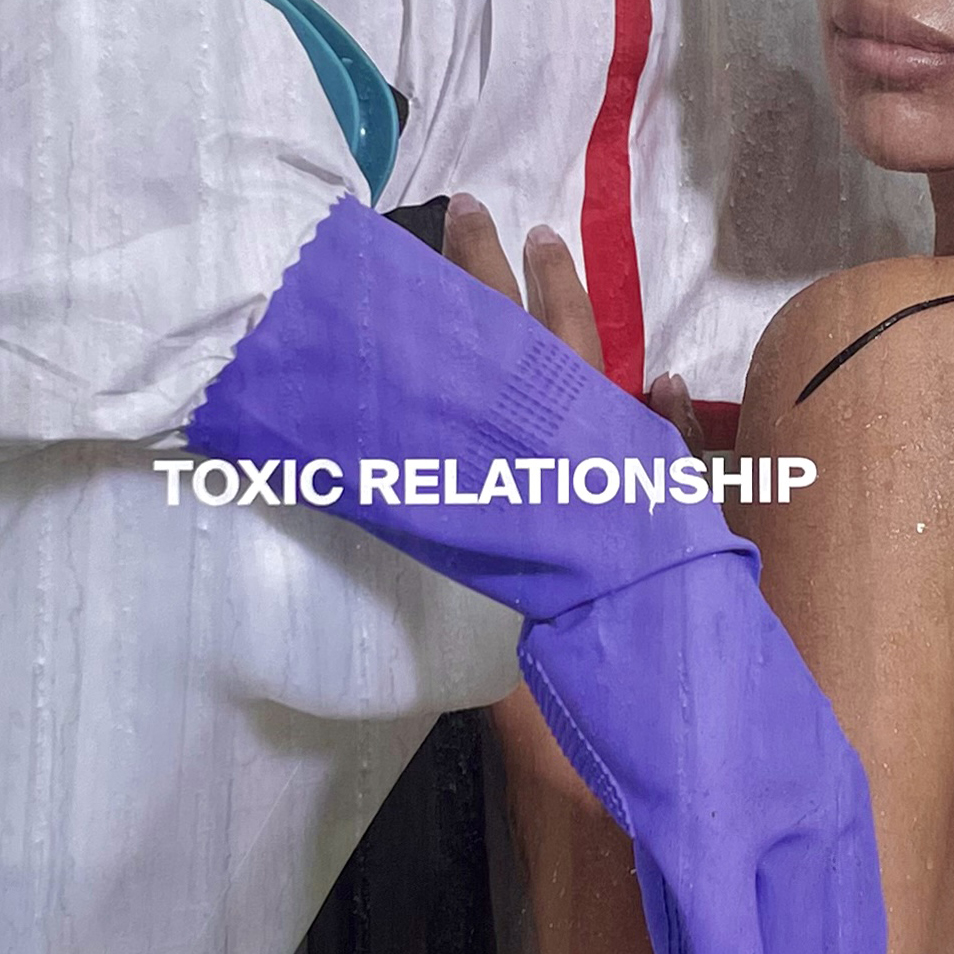
We can see the straight posture of the male, acting as a x-axis, guiding the phrase "toxic relationship” at the center of the poster. In comparison, there is the curved posture of the female on the right and the man’s arm with a similar curvature as the woman’s body on the left. The female is standing with her back to the viewer, but with her eyes gazing to the outside so clearly. The man’s gaze, masked by the gas mask, is also directed toward the viewer. Their gaze is complimented by the big capital letters, which almost feel like they, too, are looking the viewer in the eye. The rest of the poster however follows a “stacking” approach, where everything is placed in a way that perfectly fits this cubicle-like space.
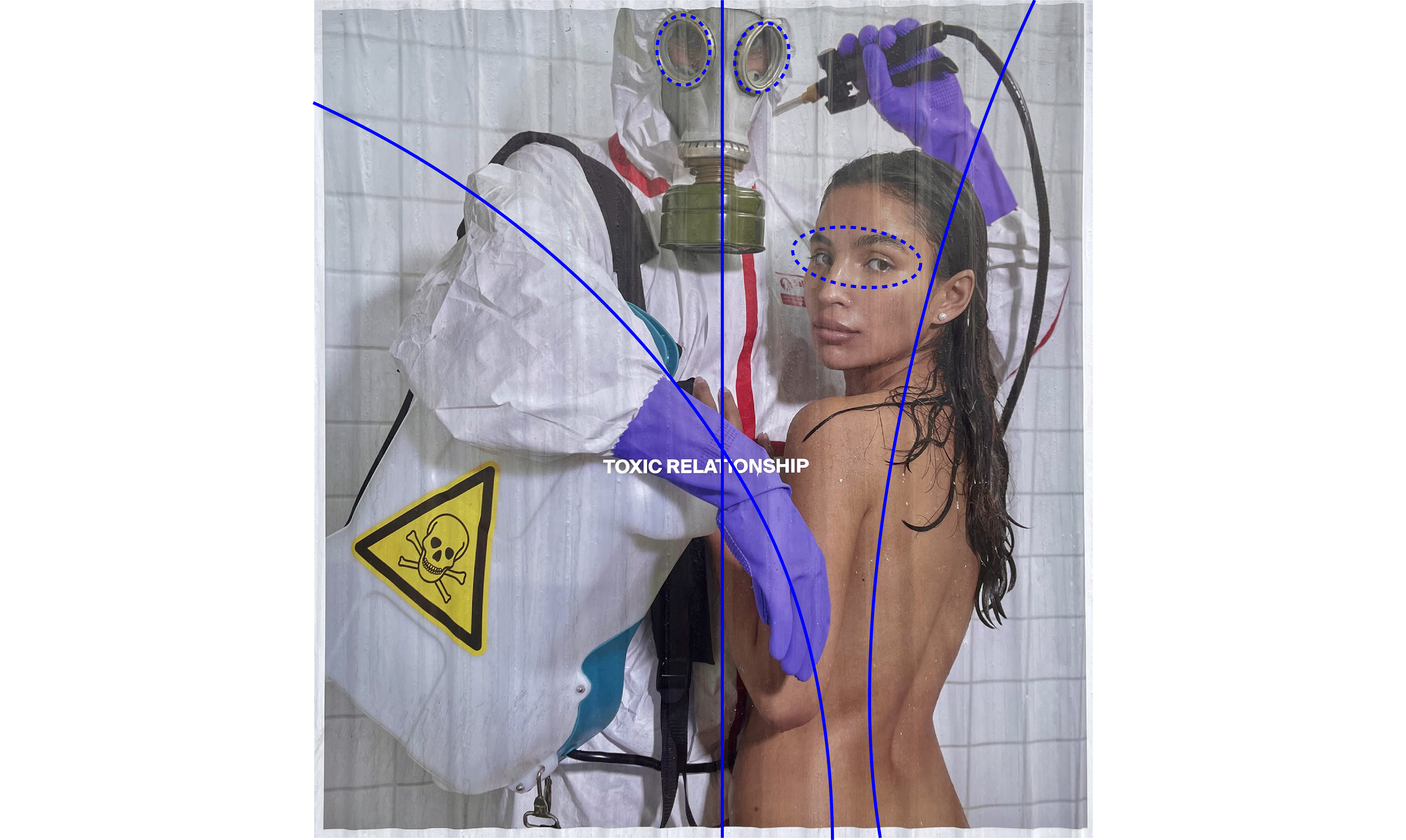

Overall, there is a lack of balance in the poster. Looking at top-bottom balance, the poster appears much heavier when rotated. This is due to the image being placed more at the top of the poster rather than exactly in the center. Another reason is the bigger space that the brand name and slogan occupies at the bottom in comparison to the headline. Looking at right-left balance, it becomes clearer when the poster is flipped that there is a lack of balance there too, given that the male figure occupies more than 50% of the vertical space.
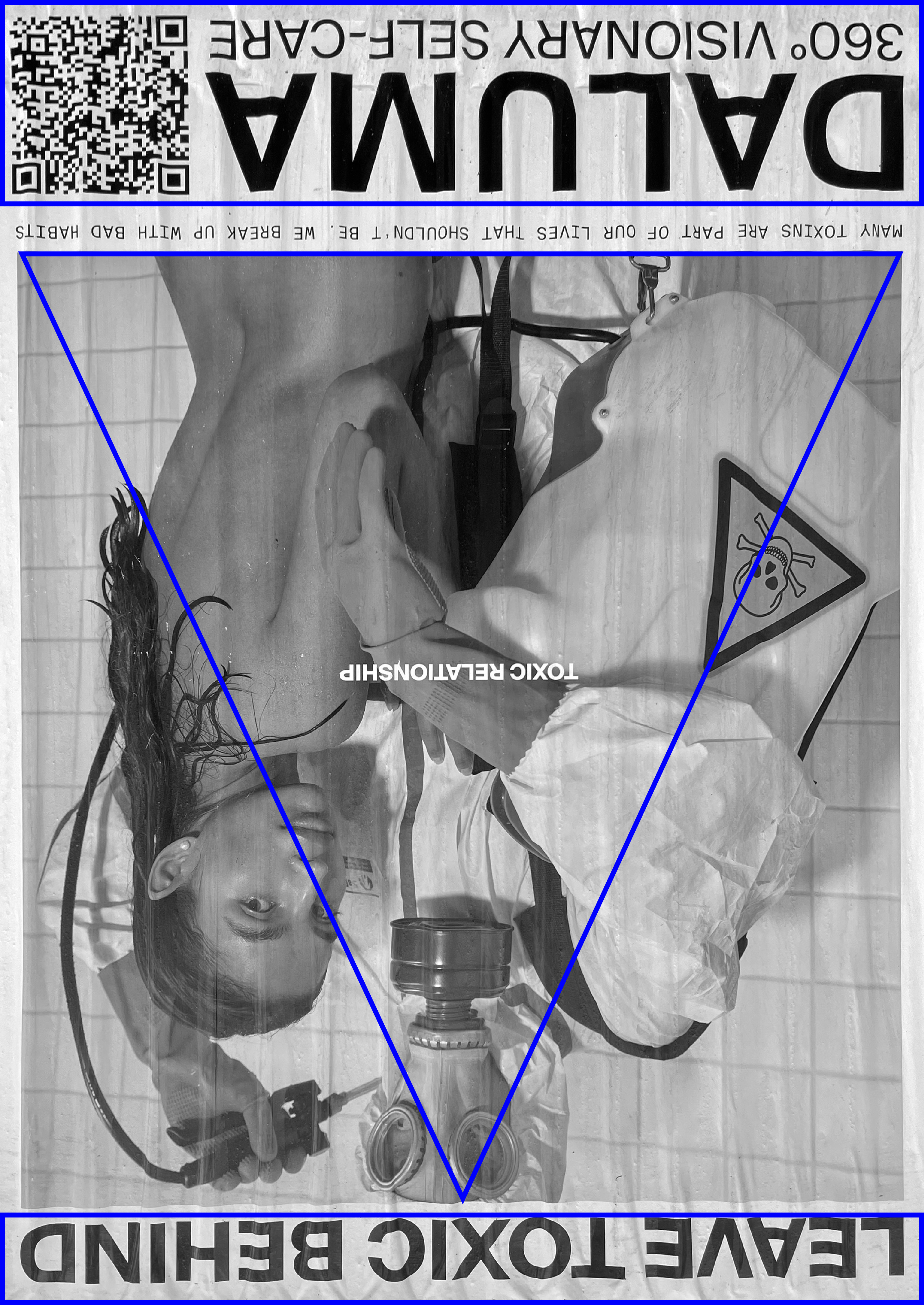
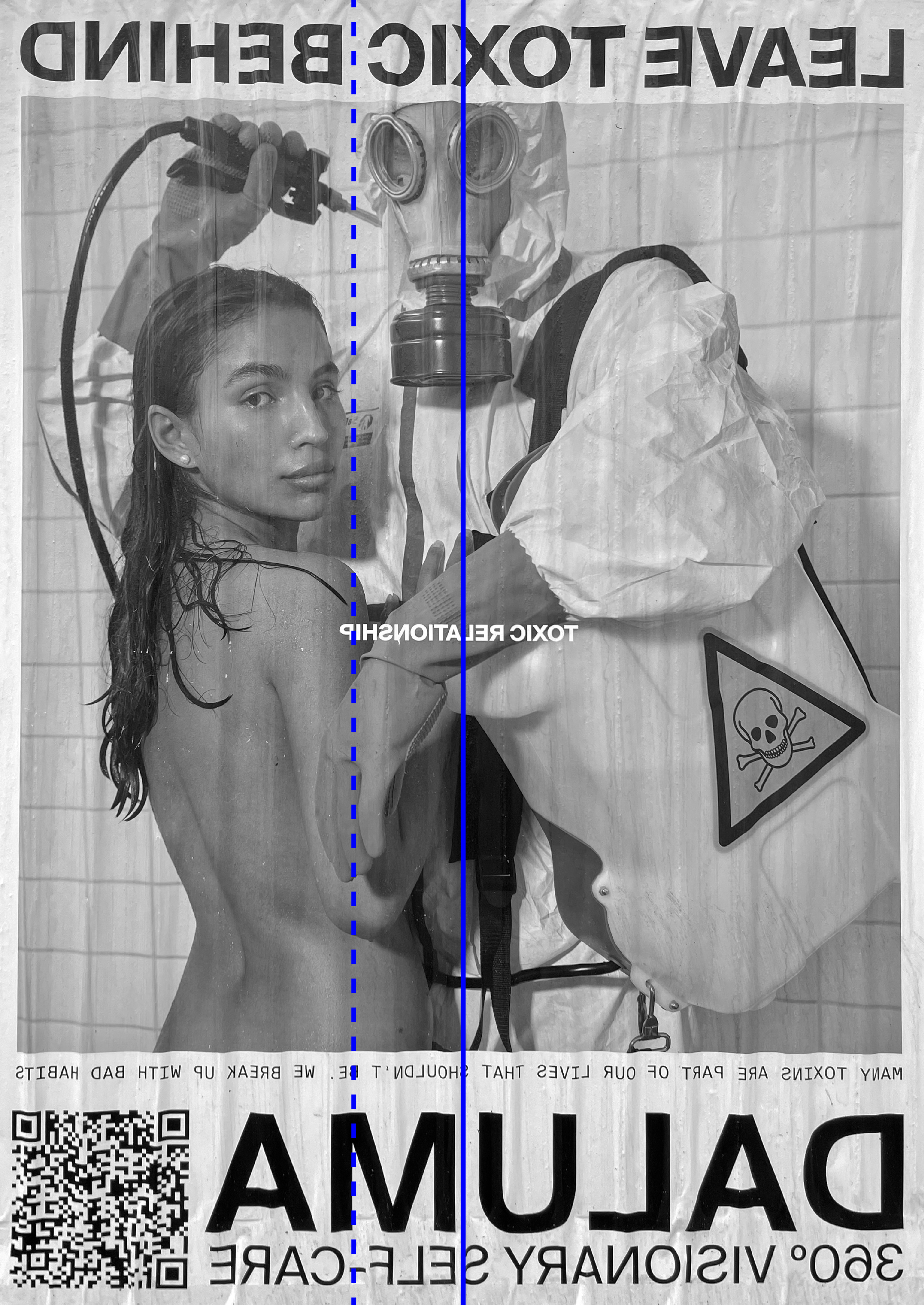
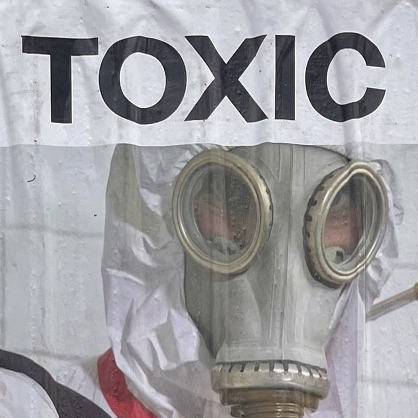
The meaning proposed by the arrangement of graphical elements here is quite literal. The headline at the top, the image caption, along with the man’s attire and tools, clearly refer to the “toxicity” of the male figure.