We will study emotions in graphic design in this order:
By affect, we understand the direct impact of graphic design on us.
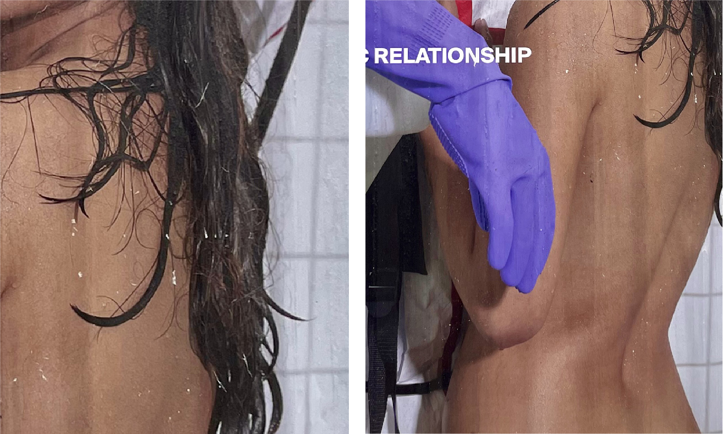
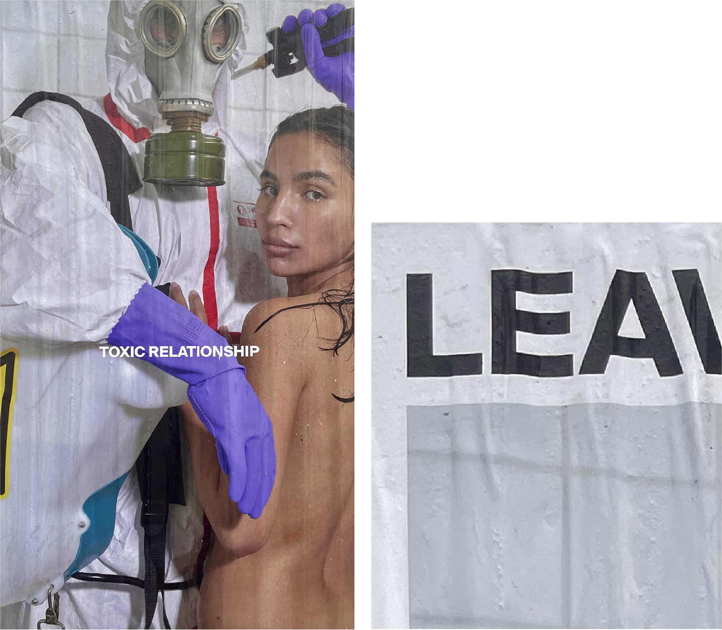
The way a design affects a viewer can be categorized into negative and positive effects. Negative effects can be described as almost 'painful', while positive ones can be identified as 'lustful'. This painful vs. lustful effect can be caused by visual elements (e.g. bright colors vs. smooth gradients) or by human representations (e.g. suffering humans vs. smiling humans). The below poster will be scanned for the two opposing effects according to a checklist through which a semantic differential will be created.
Negative [Pain]
Positive [Lust]
Negative [Pain]

Positive [Lust]

Overall, it can be inferred that the poster has a more positive effect than a negative one. With 'death' (a negative effect) as an exception, the poster contains a smooth roundish shape (i.e. human body), as well as a naked human — all having a positive, lustful effect.
Often, we are not directly affected, but just consider the graphic design emotionally: what does it express
to us?
In terms of feeling with or empathizing when looking at a design, this can be triggered first and foremost by the expressions of human figures. This is because a human's facial expression is the most readable emotional cue. Sometimes facial expressions are straightforward, making it easy to detect and recognize universal emotions, like joy, sadness, disgust, anger, fear, etc.
“J. J.” in Ekman and Friesen’s Picture of Facial Affect, POFA (Ekman & Friesen, 1976).
But what about the more complicated facial expressions? The ones that are signs of concealed emotions?
corresponding prototypes (Ekman & Friesen, 1976).
Looking at the face in the poster, at first glance, you can only see a neutral facial expression: a straight-lined mouth and slack cheeks. But one other important feature missing is ‘unfocused eyes’. The look in the woman’s eyes is like an involuntary emotional leakage exposing her true emotions. The eyes are looking straight at the viewer, with an intensity that almost feels like she is asking for help. This is a look of unease, discomfort, and perhaps even fear.

Can I be inspired by Ekman & Friesen’s morphing of facial expressions? Creating a spectrum of different expressions [using AI] with matching emotions will help in understanding the one expression in the poster by having a point of comparison.


Here, we talk in terms of mood, atmosphere, and overall impression, thinking of the whole poster as a stage. When laying out the Daluma poster alongside other designs of this genre and noticing the differences, the mood can be grasped.
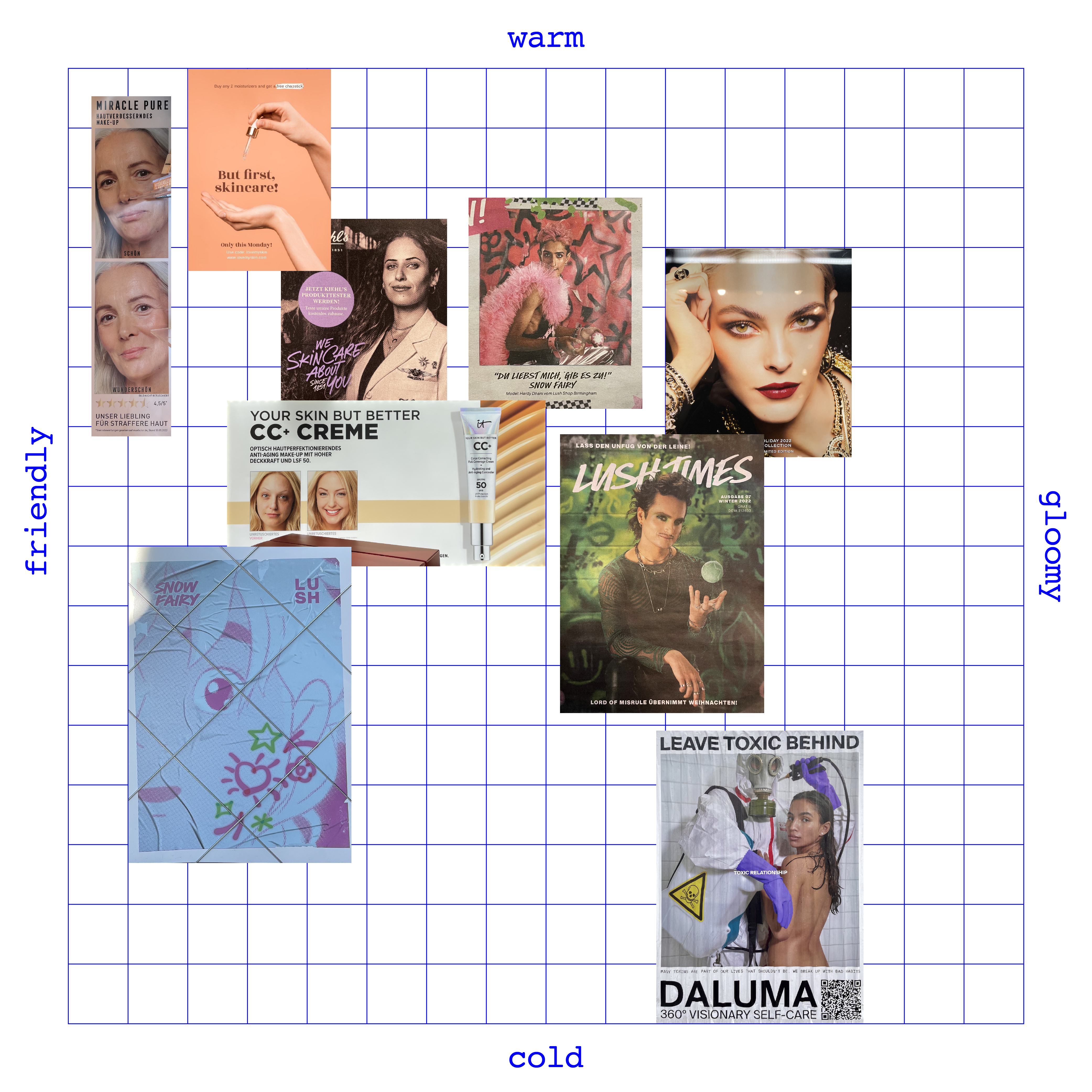
Looking at the rest of the posters, the majority fall under the ‘warm’ and ‘friendly’ side of the spectrum. This is because lifestyle and cosmetics posters are often associated with nice, cheerful vibes. They often intentionally show happy, healthy, smiling humans. The toxic poster, on the other hand, shows an entirely different mood. It’s not gloomy per se, but it is definitely cold, odd, closed, and uninviting.
Building on the previous findings and analysis, a semantic differential can now be created to measure the connotative meaning of the poster, in terms of effect, empathy, and mood.